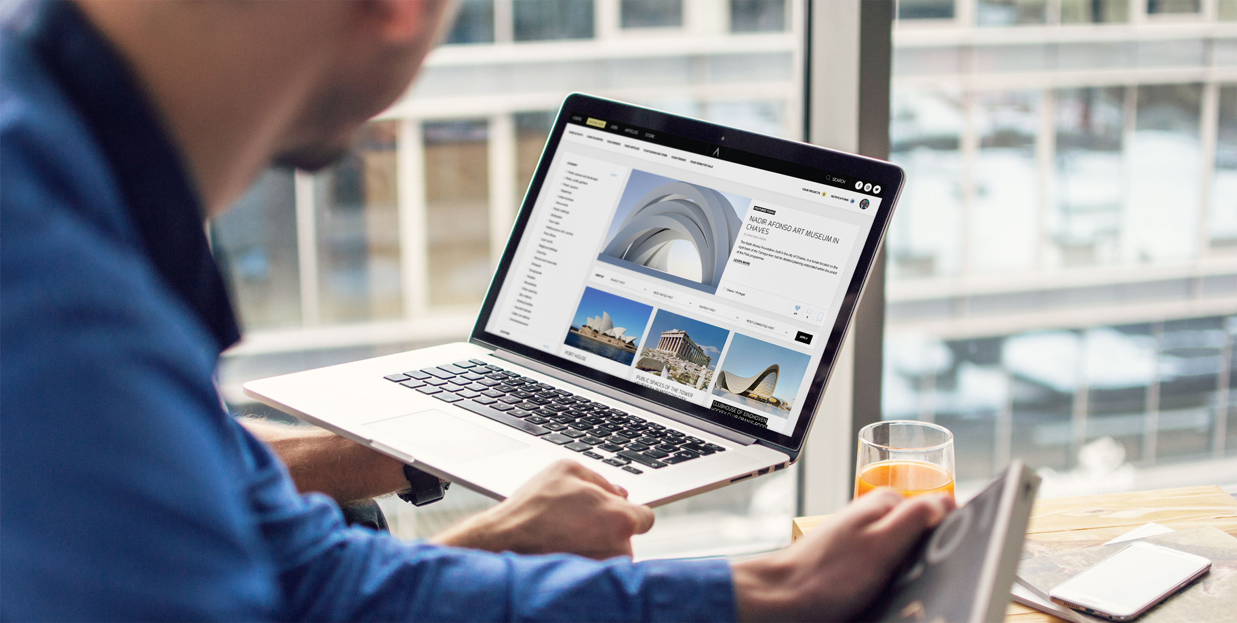
A branding project
Scope: creating a brand visual identity from scratch.
Role: brand designer, UI/UX designer, art director.
Year: 2017
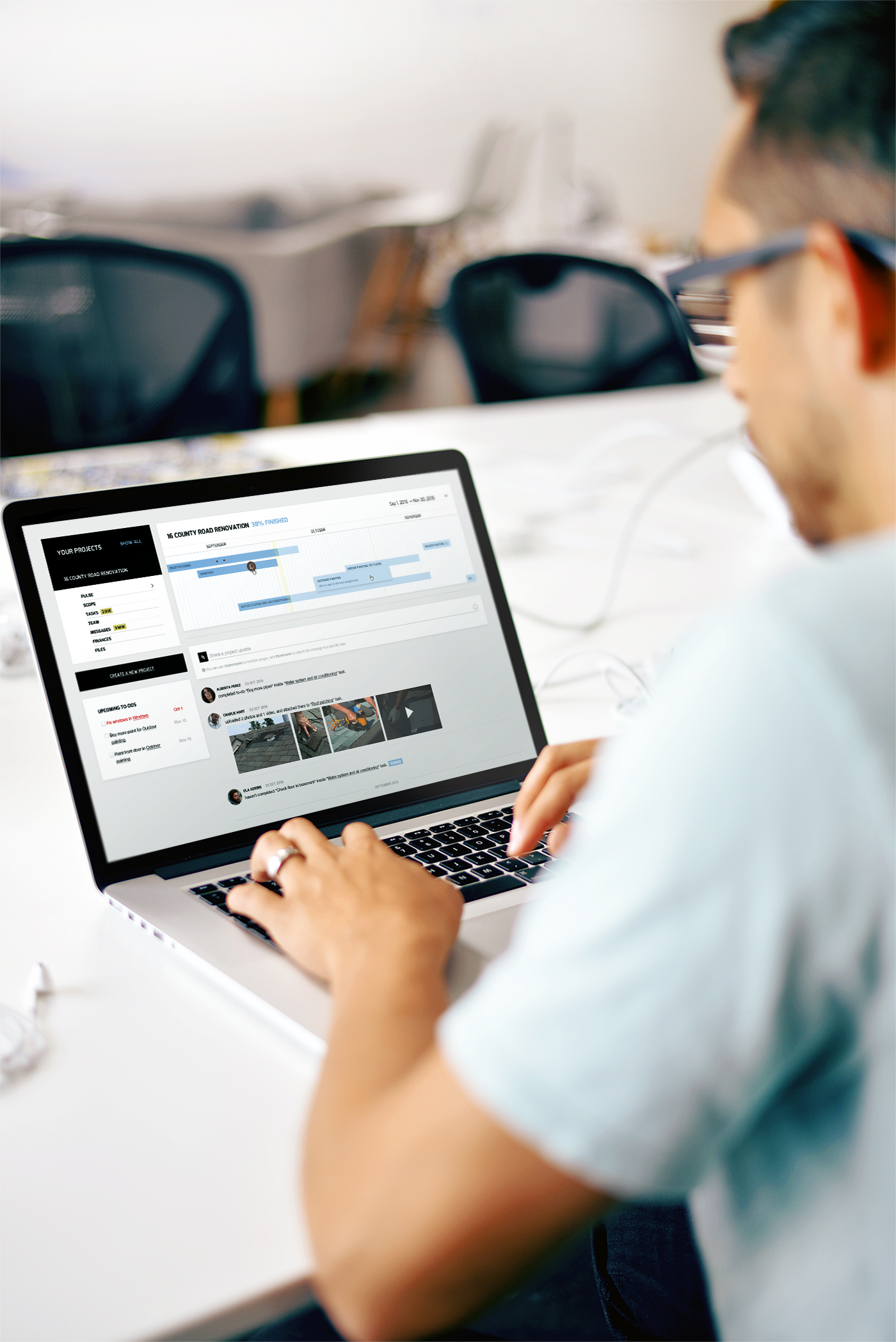 Case study, result of my test task on UI/UX designer position. Creating a brand and two webpages.
This task was my test project for a job. I found this experience interesting enough to share here.
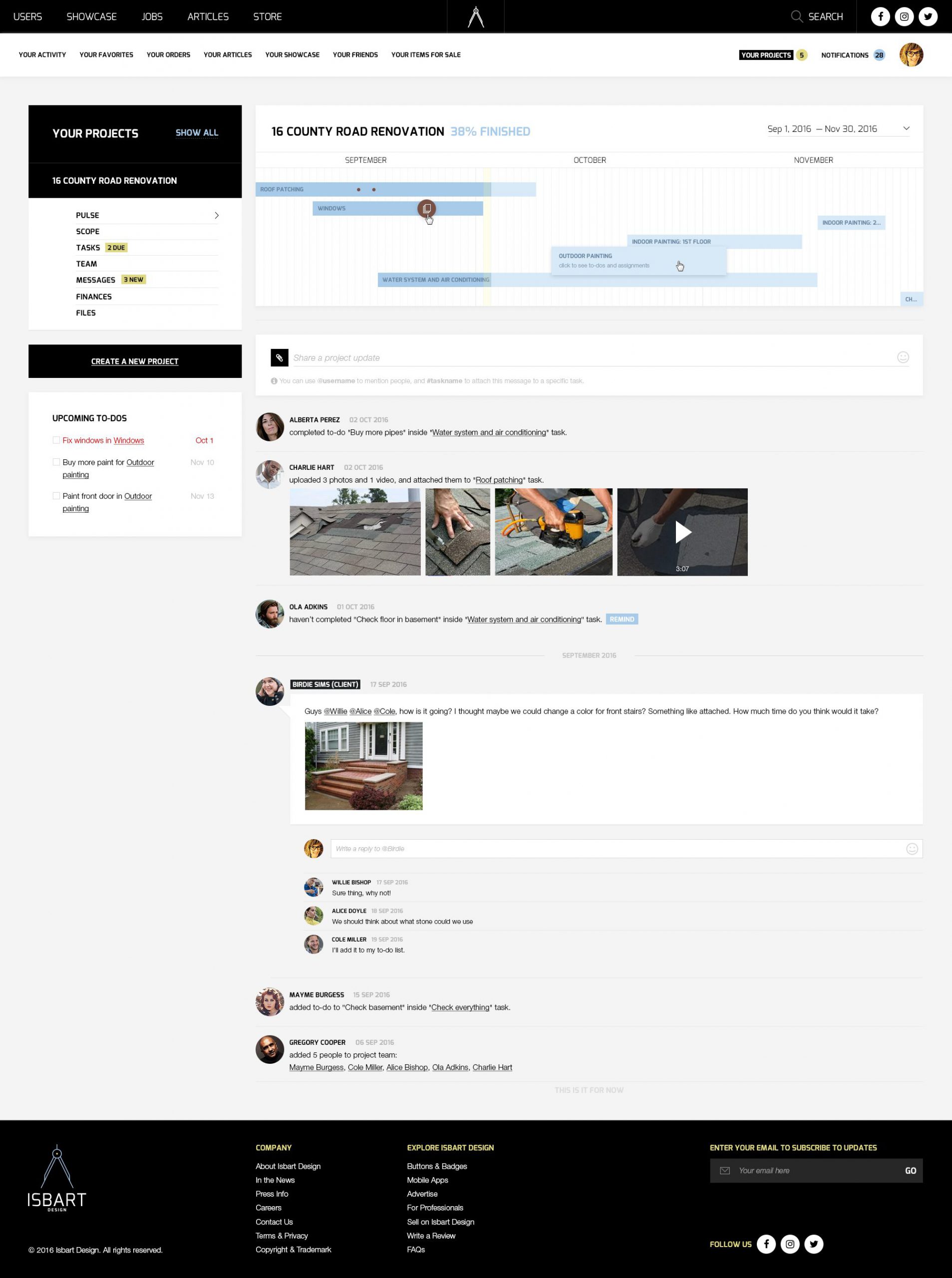
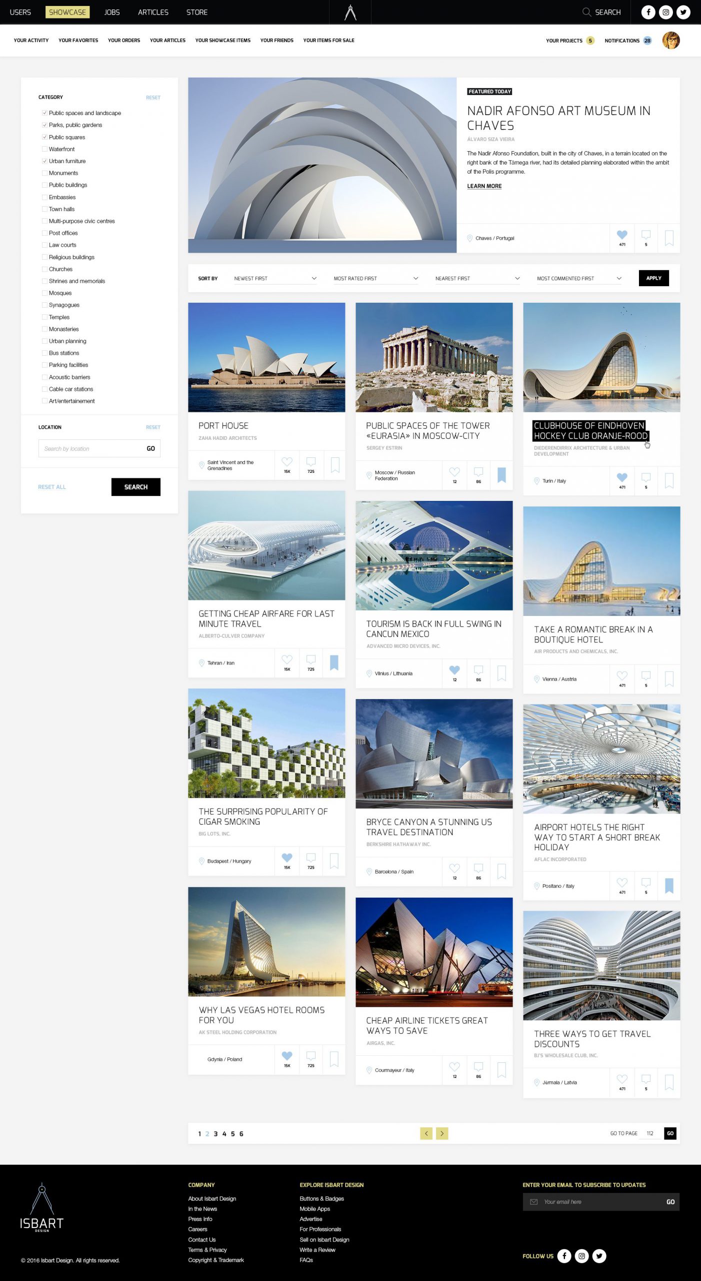
I was suggested to create a study for a new brand (should include ‘Design’ in the name) focused on a new product in the web for architects and building designers, and then to provide a brief brand manual in PDF format. My second task would be creating two webpages for this project: gallery, and page with messaging between architect and their client (sort of project management tool). I was given a week for all these tasks.
I am not a name designer, but this seemed to me a pretty interesting challenge. Plus naming itself is a very important part of any user experience, so why not try it? To forestall, I passed this task successfully. 🙂
This test task didn’t include any specific details about main idea of this service. In order to make it more real, before starting generating brand names, I assumed this service is going to be a network for architects, designers and their potential clients who could hire them via this service. Some sort of “architectural upwork.com”, but with accent on community and inspiration rather then job search.
Since my theoretical basis on the matter of naming was thin as paper, and I didn’t have time to get a deeper knowledge from books (my time for this task was limited), I addressed my questions about how to do it right to Medium.com. I know that Medium has a strong IT and internet-marketing community, and always sure I can find answers and people there. It didn’t let me down this time: I found this amazing piece, which described process in details. Assuming that my mythical project is a startup, this article fitted my case perfectly.
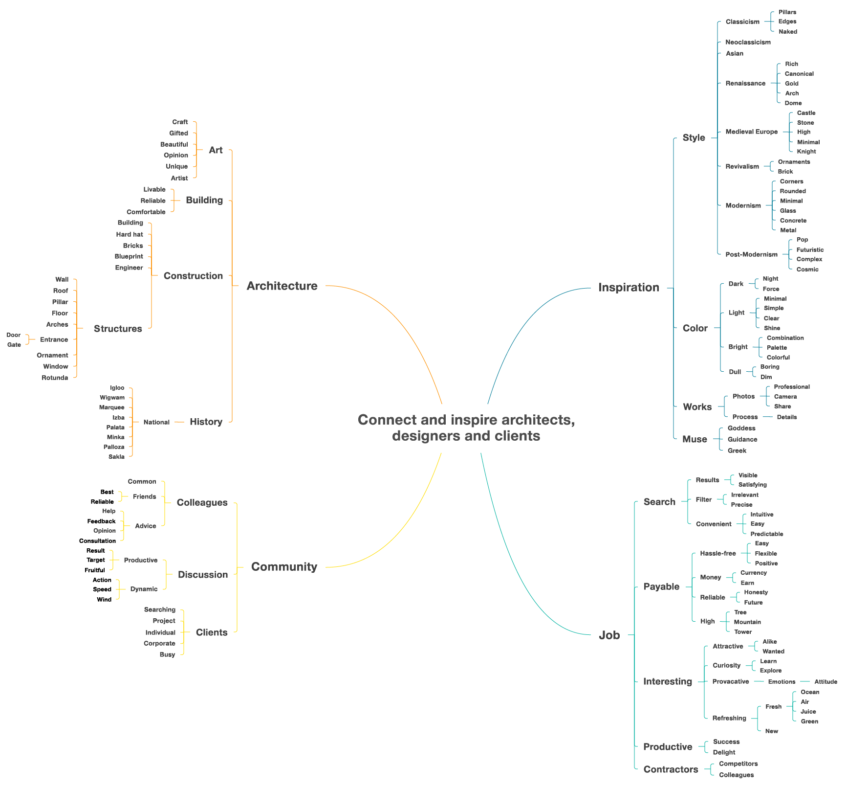
Step 1. Creating a wordmap.
In order to start thinking over this concept, I surrounded it with associations. A few branches of this map I would like to explore deeper were: National housing, Construction structures, Styles, everything about Muse, and all associations inside branch called Payable.
Step 2. Generating combinations.
Generating combinations from words I gathered, I used all techniques from the same article mentioned earlier. As a result, after picking options which had some sense, the following table was created.
| Based on domain generators | Pun-based and combinations | Rhyming | Portmanteau, made up | Prefixes + suffixes | Misspelling | Names | Slightly abstract, brand-descriptive | Acronyms |
| larre illar pelia larli classarch rotundanted halloza talloza musetect armuse | Ides of Arch Pop Arch Arch Deco Arch Nouveau Free to Muse Glass Pillar Arch Muse | MuseCrewes MuseFuse ArchDemarche MoreFloor ProofRoof | izle rea rezba arba arle muance pome domdome glaser plass | glassium glassive gatee izbart roofin roofner roofine brickwise domeese domeo domely | blprnt rufz ark hrdht bildin pillr | Impei Rohe Louis Antoni Eero | built dome stone second light arch | CIACT (Connect Inspire Architects Clients) InCAC (Inspire Connect Architects Clients) ArtCoM (Art Community Money) DIBL (Discuss Inspire Build) |
Words I liked the most are marked with bold. The only thing left was to pick the best option. Since it was a test task, I didn’t have enough time to conduct research in order to understand what options convey more positive emotions. So I trusted my own judgments. I wanted to choose something which wouldn’t be already taken, related to my origin country, wouldn’t sound like a disease, and at the same time would be easy to write and pronounce. I made my decision, and the only thing left was to add word “design” to it. So, for this project I chose…
isbart design
In Russian “izba” means national countryside log house. I united this word with “art” which would mean “art” itself, and shortened version of “architect”. The whole word is easy to pronounce and short. I replaced sharp “z” with soft “s”, which sounded and looked softer, and would help people to pronounce the word with correct emphasis. At the moment of writing this case study, this domain was available everywhere.
Step 3. Creating logo and brand guidelines.
I started this process from generating a moodboard. I prefer gathering this kind of inspiration first, because it helps to concentrate on emotions I’m going to convey with my project.
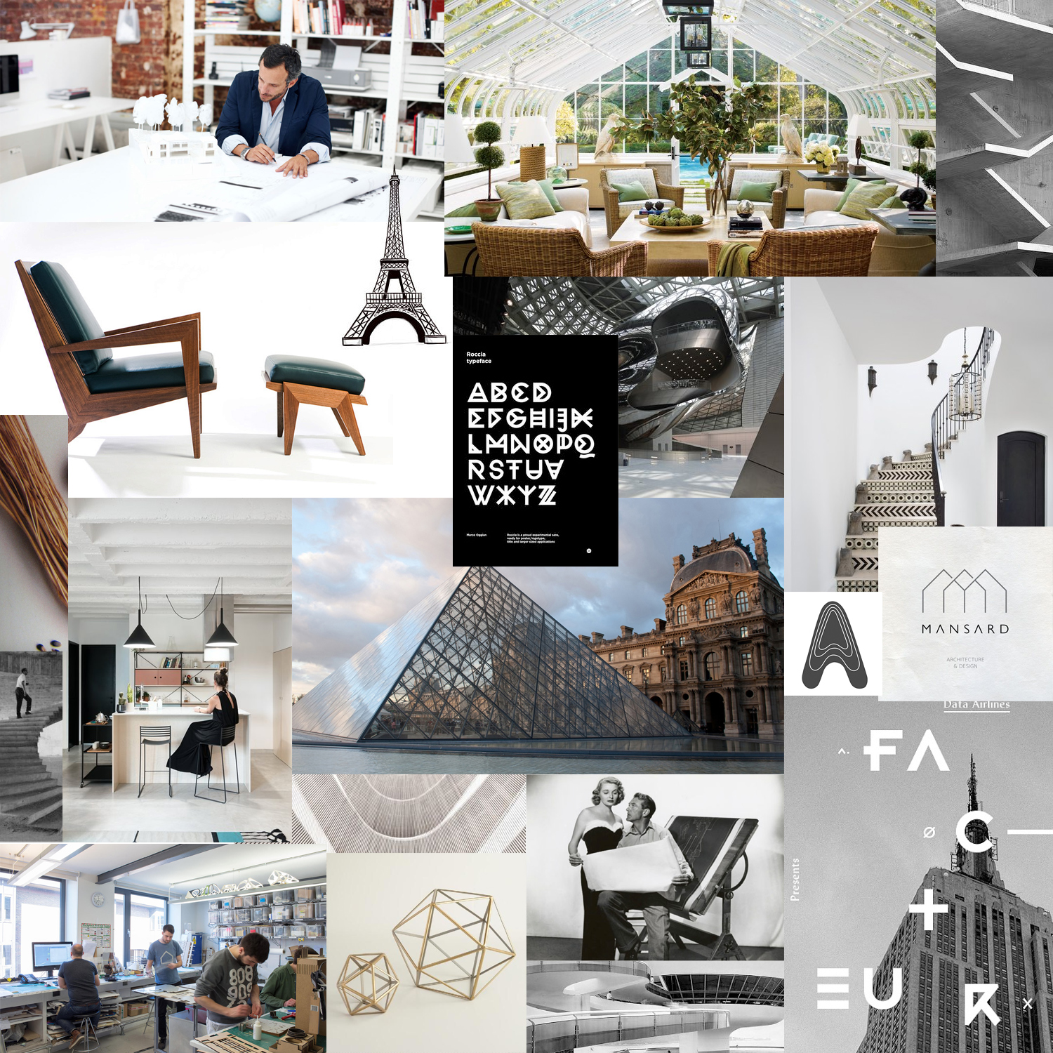
This moodboard helped me to define basic color combinations for my brand. I was choosing from 3 options, and picked the one in the middle. I like that it’s almost monochrome, but has soft and natural-looking highlights, which can be used for promo elements in future.

For company style I decided to stick to minimal visuals and fonts, to try to combine motives of nature and futuristic elements. It seemed to me a good thing to explore images of dome and house. I thought about trying out versions with and without logomark, so typeface itself was also pretty important. Below you can find logotype and logomark options I brainstormed (I highlighted options I was interested in the most).
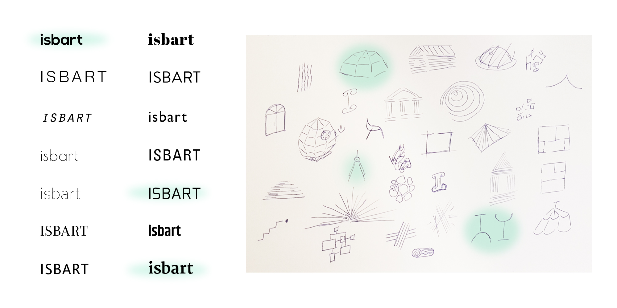
Choosing logomark, I reduced my choice to three visuals: сaliper compasses, abstract dome made of dashes, and combination of a wineglass and a lamp (because this service would target interior designers as well). Next step was combining logos themselves. I generated 12 options based on 3 fonts and 3 visuals + 3 options without logomark at all.
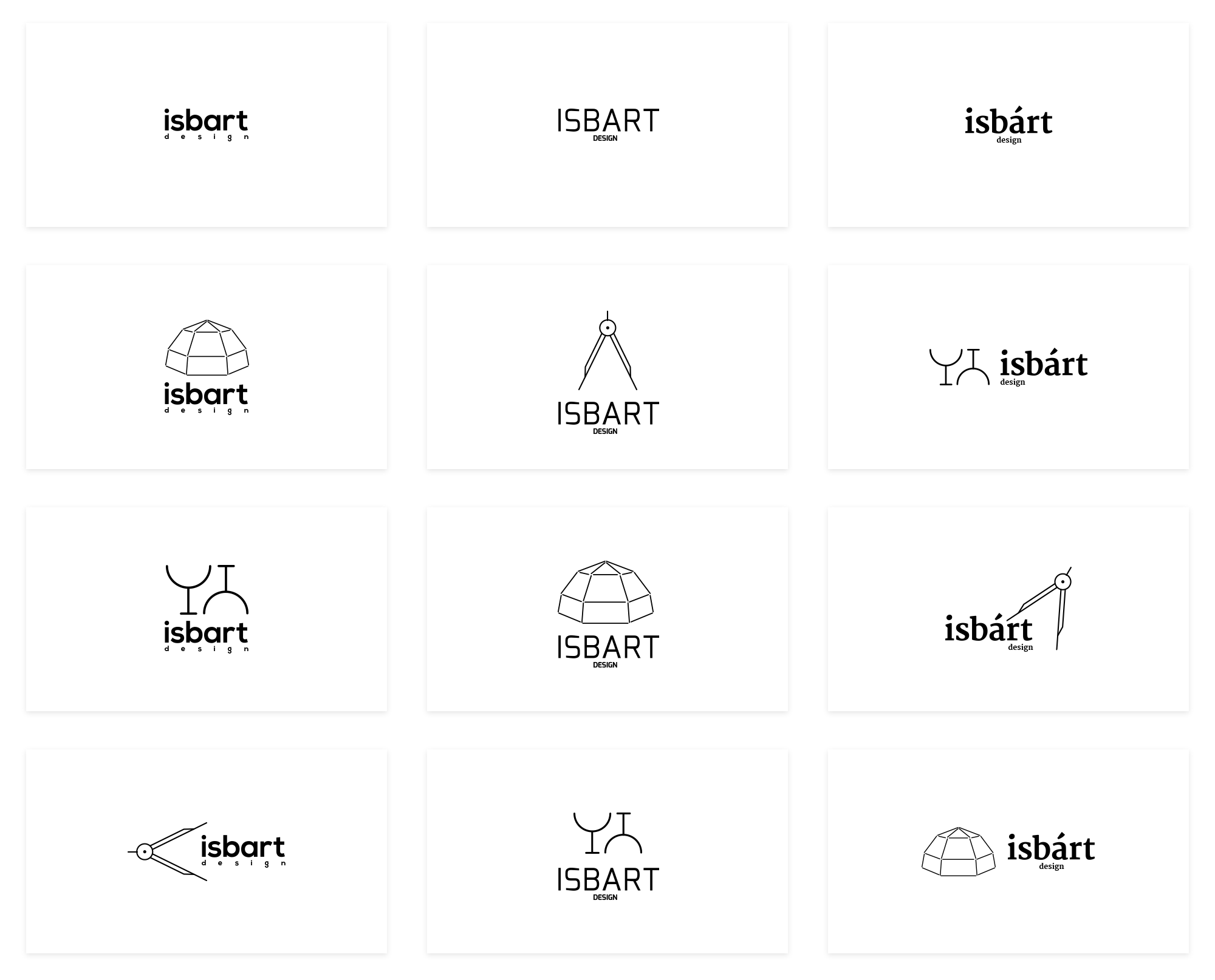
And my personal finalist would be…
My work on logo was finished, and the only thing I had to do for my brand is to gather a brief brand manual in PDF.
Step 4. Creating two website pages.
Creating design for a website is not possible without understanding its structure. And creating a structure is not possible without understanding user goals and analysis of potential set of features. Unfortunately I didn’t have time for complete research, like I did here, so I decided to proceed with understanding who my persona(s) would be, shallow competitive analysis and quick generating of list of potential features.
A couple of words about Isbart Design potential user. I assumed that service would have two personas:
- Architect or designer, who is 25-45 years old, busy freelancing or working full-time in a studio or construction company. Creative and communicative, quite organized, but not a neat freak.
- Client, who would be actually a dark horse: it can be anybody who has certain intention, financial and time opportunities to design or build something, and is looking for professional for this task. Thinking about client, as a designer of this service I should expect that they can be tech-savvy, or on the contrary, have very small experience with technology. This person could be be a corporate client or individual. It could also be a colleague who is looking for help for their project.
Search of direct and indirect competitors gave me the following results (here are the closest competitors I found at that moment):
These websites helped me to understand what set of tools architects expect to find in such service. The following features were common for all websites:
Account — the most important section since we are building a community which is not possible without user log in and corresponding toolset.
Projects / Photos — showcase of designers and architects works.
Blogs or forums — communication.
Catalog of professionals — so user could find a future hire, or colleague.
Search — all websites have a lot of information, and this is important to make it searchable.
Products — 3 of 4 websites above had this feature. This section is basically on-line store where users could sell their services, digital products (like 3d models) or physical items (like furniture).
Articles — good thing to have on website for SEO, and to spur discussion among users.
In all four websites I didn’t manage to find information if they have a project management features which would allow users and clients keep track of their projects online, inside their personal accounts. So this is something I should have invented for users in order to complete my test task.
I created the following sitemap. Sections I had to create in order to complete my test tasks are marked with red.
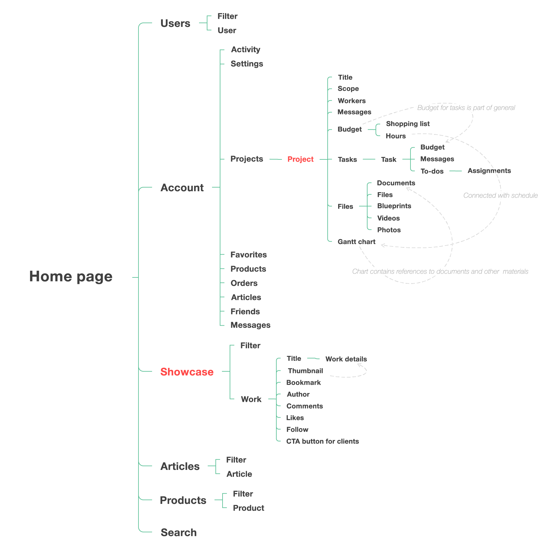
If Showcase section was pretty clear to understand, structure of Project section was, on the contrary, generated based only on my assumptions. I have experience using such project management tools as Slack, Trello, Asana, Basecamp, Bitrix24, and felt inspired with their usability.
One of my ideas was creating sort of project pulse: timeline where users could find all history of a project, most recent changes, ans where client could approve or request changes with just one click.
Also, I realized that this specific project management section should have been created with mobile-first approach: my personas would use it on the go, working mostly with their team, and probably commenting or uploading files right from objects using their smartphones. This assumption made idea of a timeline even more attractive.
It was very important for every participant of a project to have always up-to-date list of assignments so nothing could be missed. That’s why I thought it would be nice to keep user’s tasks always at hand (and also give them an option to see all assignments in project details). Function of reminding about a task from one user to another probably would be nice to have for more productive teamwork.
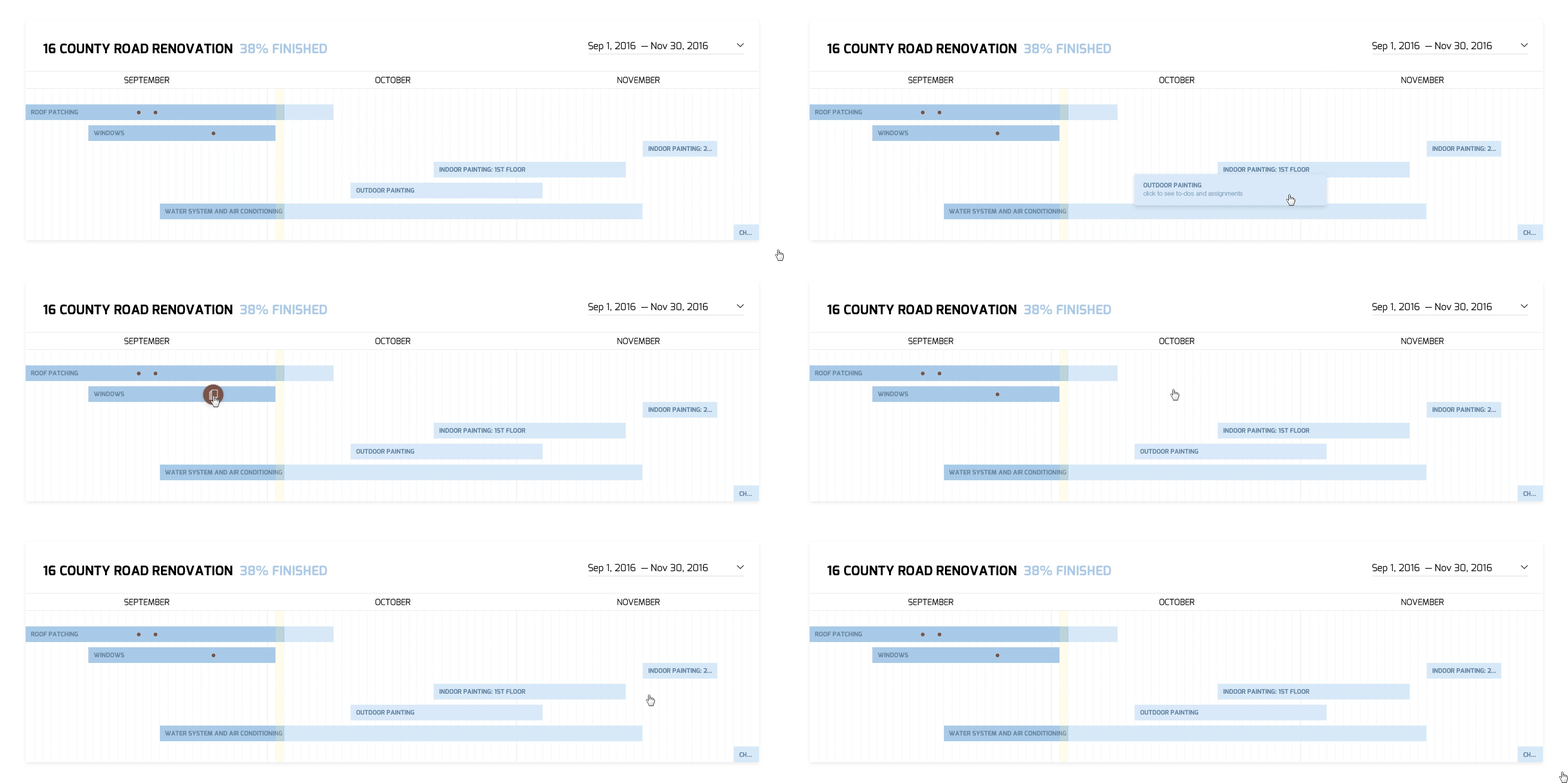
Another idea I liked is easy access to materials of every stage from Gantt chart. I see this diagram as one of core element of a project, so why not make it clickable? Bitrix24 already has this kind of feature, but I thought about going further and suggest user to click on segments in order to see all actions performed during this segment. Such click could provide information about what tasks were completed, what is assigned and to whom, what purchases were made, photos, videos and documents uploaded and which of them are waiting for approval.
Having all these features in mind, I moved to paper prototyping. Due to time shortage I had to prioritize my tasks: my plan was to create mobile prototypes first in order to use mobile-first approach, then expand them for desktop version, and then to create a final mockup for desktop version only since mobile design options were not specified there.
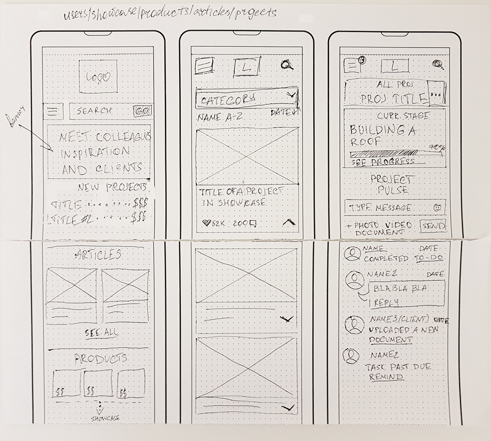
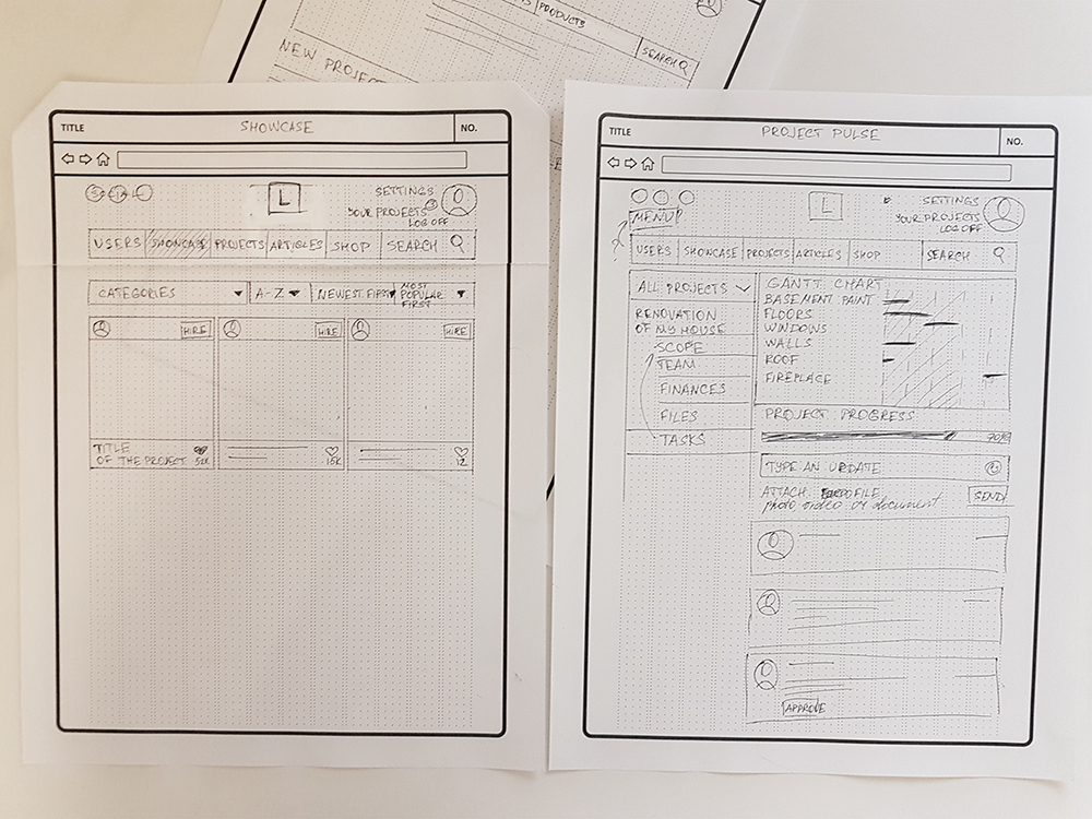
Like you can see on prototype, I wasn’t sure about menu placement. It fitted all pages perfectly, except for project page: there it was completely unnecessary. That’s why in my final designs I put it on very top. Another change I made compared to these prototypes was adding a location for every showcase item. During my work on prototype, I assumed that it would be possibly confusing for a user to have “Projects” item in main menu, and “Your project” in user menu. That’s why I renamed link in main menu to “Jobs” so purpose of this section would be clearer.
On project dashboard I planned to give user an option to click on a segment to see details. Brown dot means that there was a file uploaded (document, video or photo). Click on this dot would open this file(s). Click on any chart segment would open to-dos and assignments related to this task, as well as media files if there were any.
What would I do differently for this project next time? As a test project, it didn’t have enough research, wasn’t tested, and prototypes were created only for two specific sections. It also lacks feedback from client since this time I was a employer and employee myself. These things would be surely included into UI/UX project for a real client.
Thank you for reading!
