Healthy Ready
Scope: homepage design for the delivery of fresh and healthy prepared food.
Role: UI/UX designer, art director.
Year: 2016
Food delivery is now more popular than ever: over 100 million users have ordered online food delivery within the past year.
However, back in 2016, it was only at the beginning of its growth. Healthy Ready was one of the pioneers in healthy farm-to-table food delivery back then. They were looking for a new website, and I was invited to participate in the company’s tender to help them find visual direction for their brand.
To get started, the client provided me with the company logo and 3 inspirational websites, along with a description of company needs and goals.
To understand the visual language of the food delivery market better, my first step was analyzing competitors. It helps a lot when it comes to insights into a new emerging market, or for just a better look at market language and visual conventions.
Armed with this information, I realized how to make the user experience for Healthy Ready better and stronger than competitors have.
The process
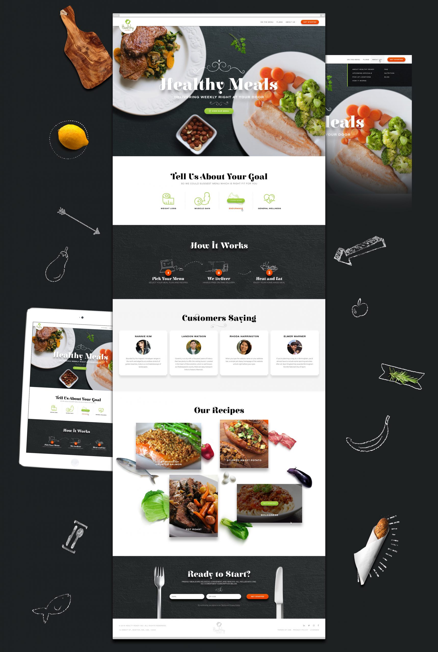
I defined the following key elements to include in the design:
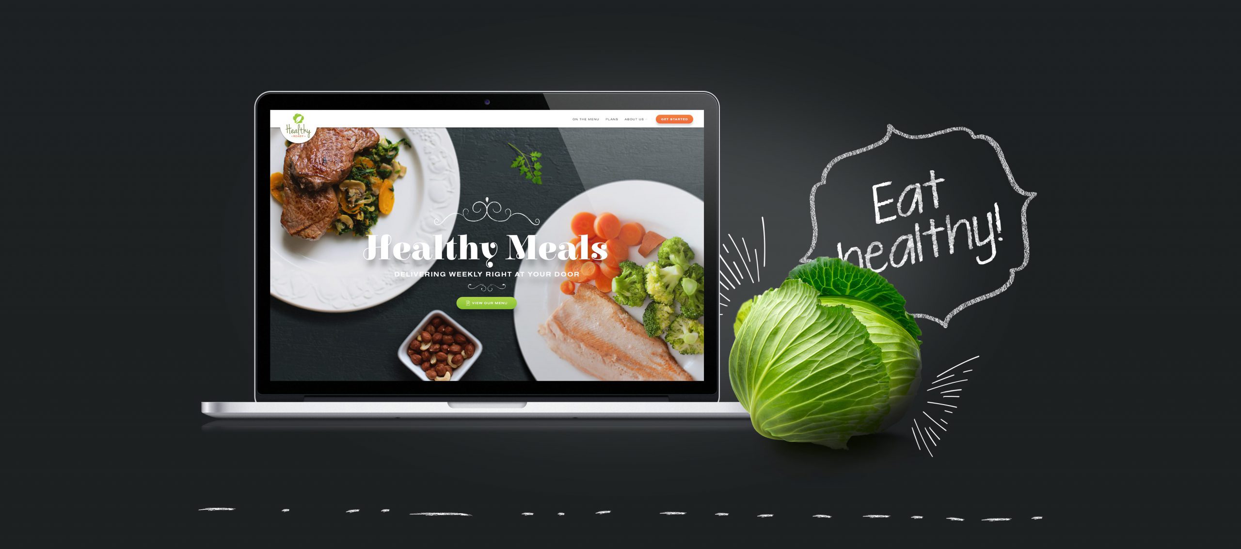
- The value proposition with prominent image and welcoming text.
- Eye-catching call-to-action (“Get started” button).
- Introducing ease of use of the service (“How it works”).
- Overview of meal plan choices (to cover users with different tastes).
- Social proof (testimonials).
- Demonstration of the flexibility of the service (examples of recipes).
- Company story.
- Call to action again.
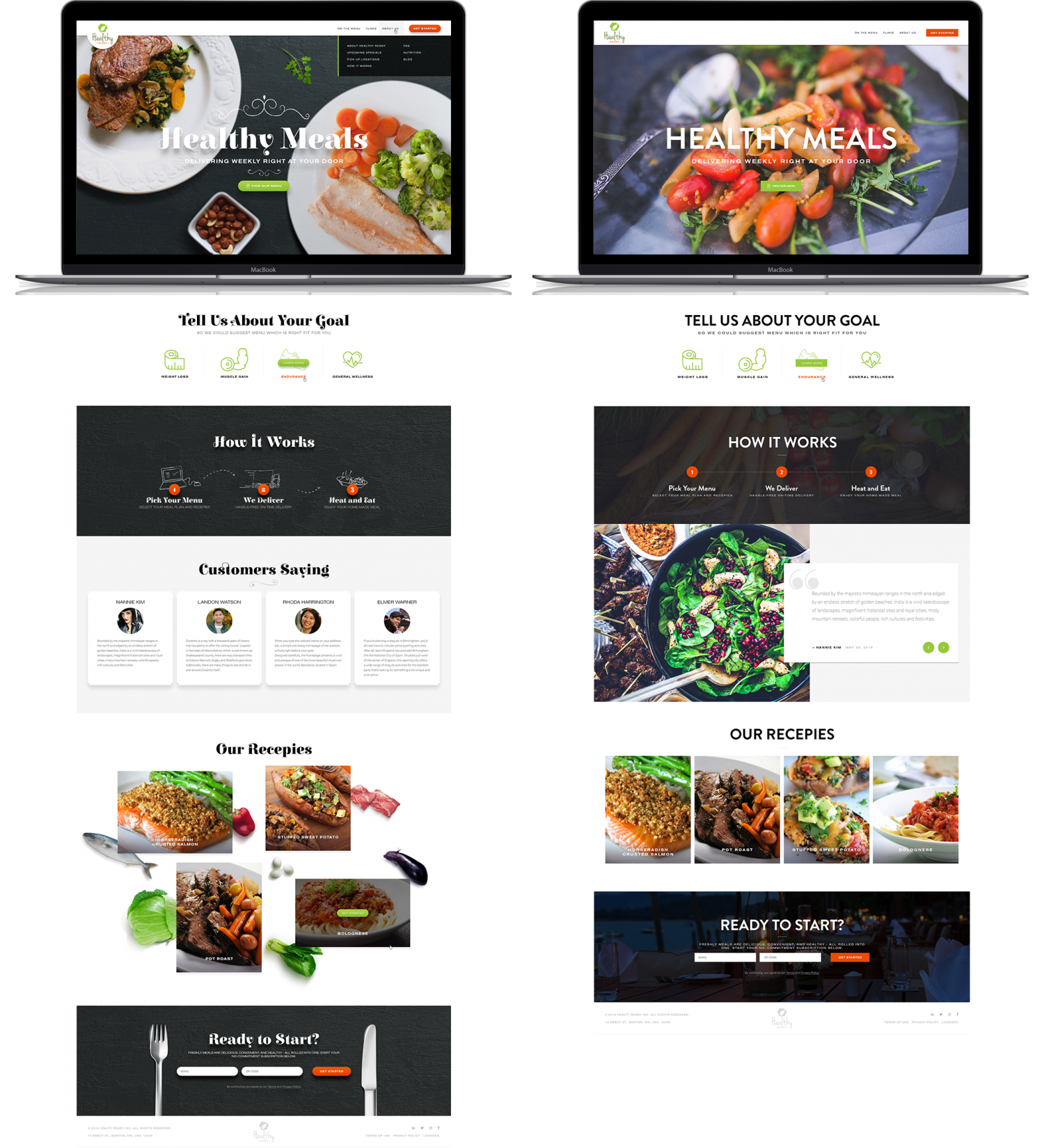
To cover two different visual directions for this website, I created 2 style options for the homepage playing with logo colors as main highlights.
The first option I suggested was very much rustic, with chalk details, and bold playful fonts. It relies on natural wooden textures and delicious-looking foods.
The second option is more minimalistic, sophisticated, with photos highlighting cooking experience and final product.
Both options focus on different strengths of the service, and it was time for the client to decide which direction they prefer.
The result
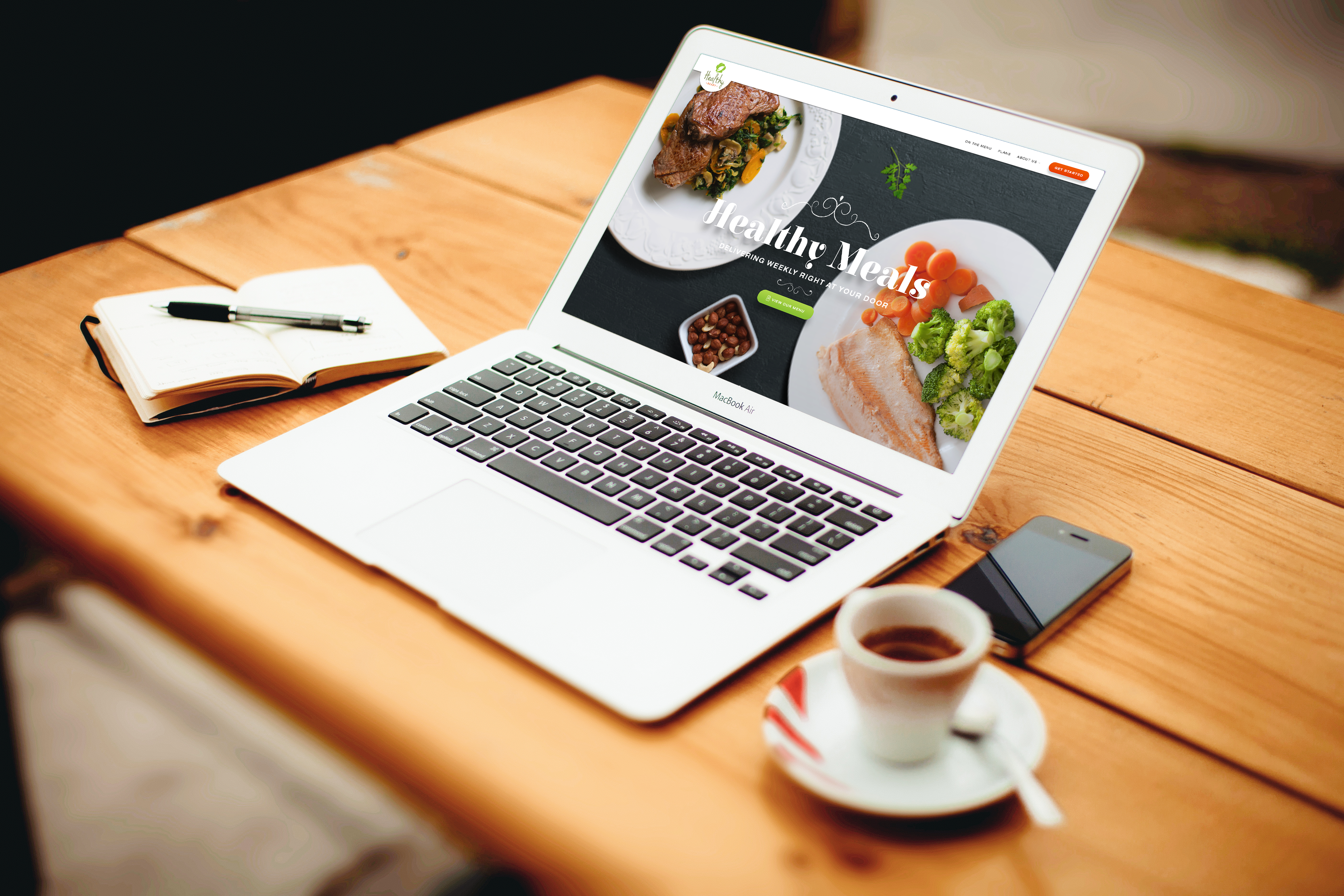
The client loved the result and selected the option you can find below.
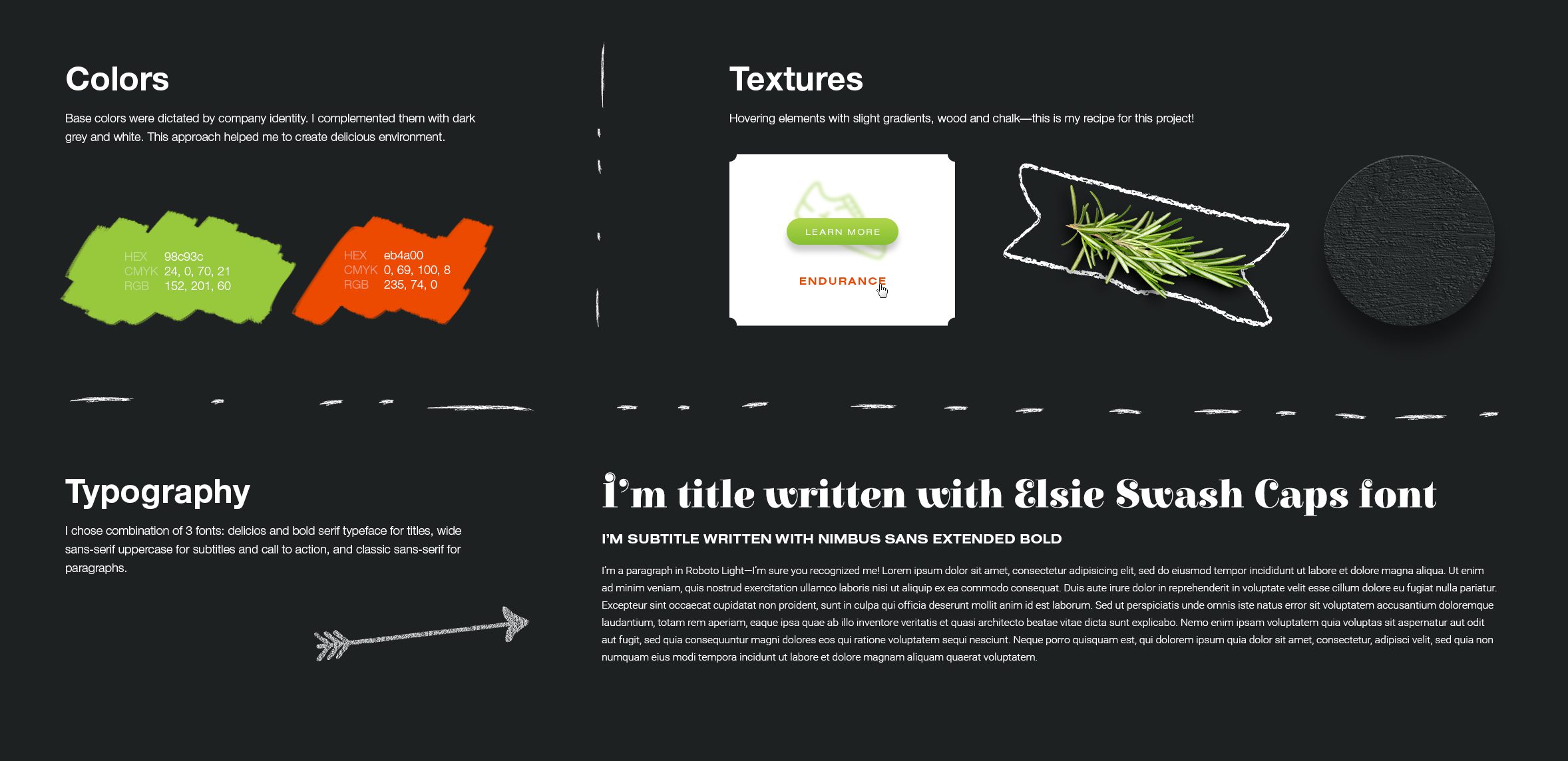
I also included a brief overview of the visual style guide as a jumpstart for their in-house designer.
