Dating Website
Scope: redesigning interface of a dating website for people with medical conditions. Optimizing user experience using heuristic analysis, personal practice, and design skills.
Role: UI/UX designer.
Year: 2016
The process
I was trusted to rework design for this dating service since client and project manager both had concerns about how people perceive its color scheme, specific pages and interactions. I was given a freedom to manage elements in order to make all actions more clear for a user.
In order to complete this task, I was provided results of initial audit from project manager, and set of PSD files from previous designer of the project.
Since I wasn’t familiar with the project structure, I started from recreating it using some sort of diagram, trying to connect all pages to each other. I wasn’t only looking at page title, but tried to understand what exact element lead to what page. So my aim was not just create a sitemap, but go through all elements as I were a user, and create detailed paths based on designs I had.
Initial sorting of all pages by name helped a lot: thanks to that I saw clusters of information right in my layers panel.
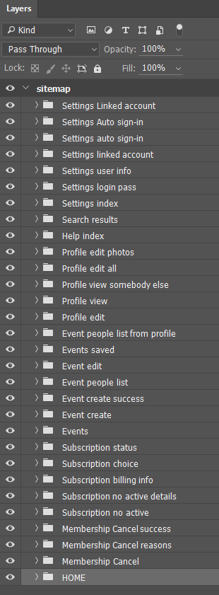
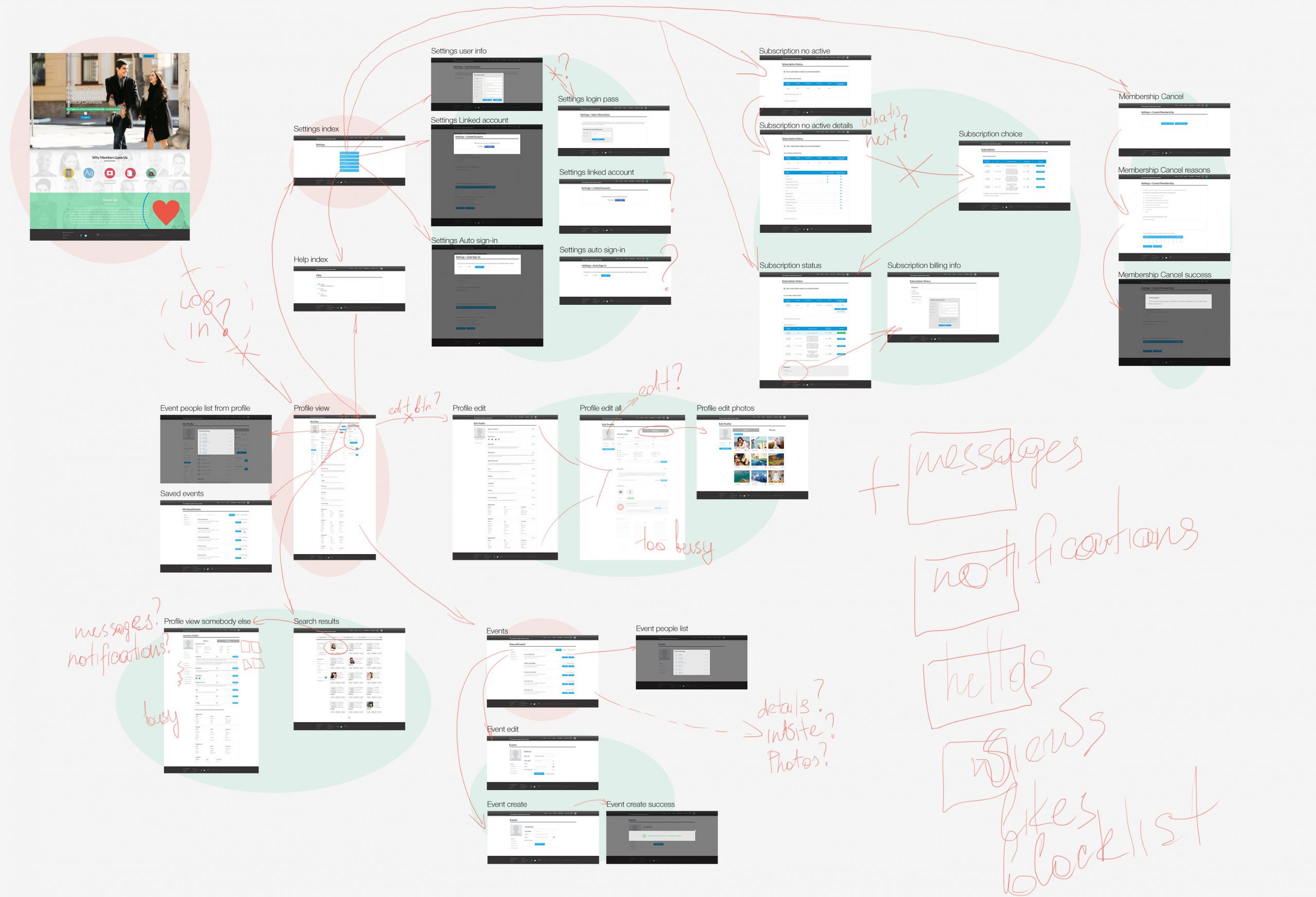
Once preparations were finished, it became clear that there are a lot of connections between pages lost, which meant that I should add missing pages or elements in order to connect sections. Part of existing pages were duplicated or too busy, which could confuse user.
So by that moment I got the full picture. Keeping in mind information I gathered, and edits requested by project manager, I started recreate website pages step by step.

The results
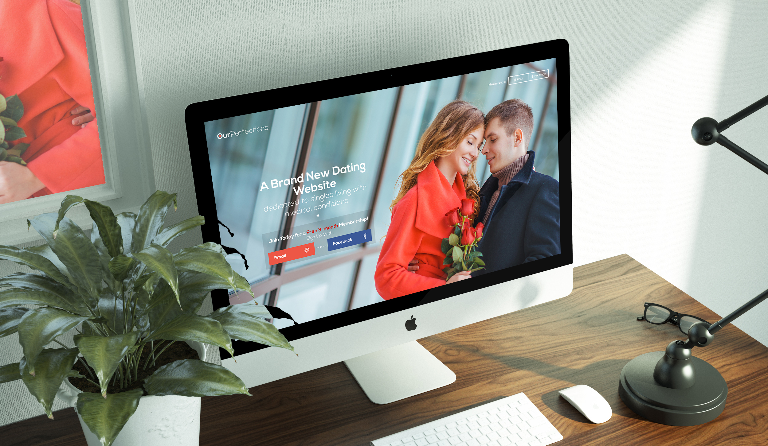
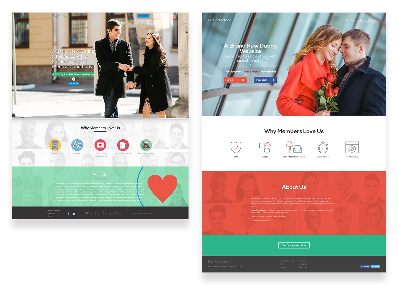
Changes for front page can be found below. First of all, I made sure I use all space of the browser window, and changed design to full-width. Also, I wanted to make sure that request of the project manager to change text on main banner treatment: in old version user could decide that 30-day trial is only available for users who didn’t logged in via Facebook. It was pretty confusing, so I gave user more clear choice. I also made sure that all login options are available at a first sight and not hidden. I made a decision to add call to action button in footer since after looking at project features and information about website, user could be convinced to sign up. Readability of other elements on the page was also improved.
Working on inner pages I kept in mind that I should:
- avoid popups where possible;
- not to be afraid of extra steps where user benefits from them.
It doesn’t matter how many times I have to click, as long as each click is a mindless, unambiguous choice.
—KRUG’S SECOND LAW OF USABILITY
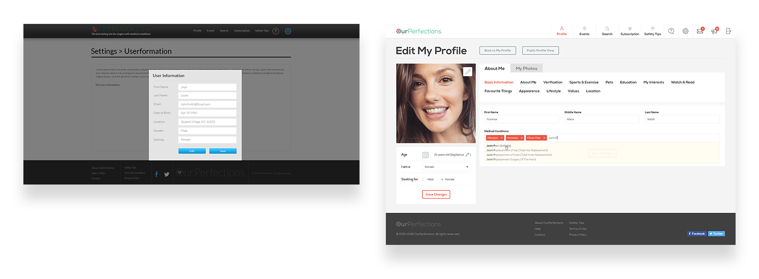
It wasn’t possible to avoid popups completely, but they were successfully removed for such crucial sections as editing user details or log in.
It was obvious that the whole structure needs to be rebuilt. For example, following common sense, I moved editing personal details from Settings to Profile, since most likely user were looking for this kind of form in Profile edits. Now settings contain only preferences regarding website usage in paid and free mode. And user information from initial popup was sorted out in sections where it belongs.
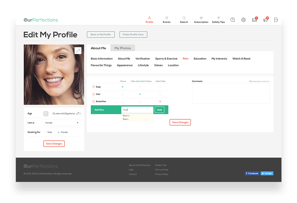
Thinking about clarity over quantity (of clicks), I suggested separated with tabs profile editing. Now user can see all sections in one screen, and each section contains reasonable amount of fields to fill in. Thanks to this change, even such large forms as preferences about pets can be seen above the fold.
Continuing working on project structure, I developed such major sections as Message center and Notifications center. Remembering about the fact that this website is created for people with medical conditions, and one of them could be memory issues, I also suggested My activity section where user could find out more about their actions.
Speaking of medical conditions, I should mention that design was checked on readability for people with color blindness. To make sure design is readable for people with such conditions, I checked pages in monochrome:
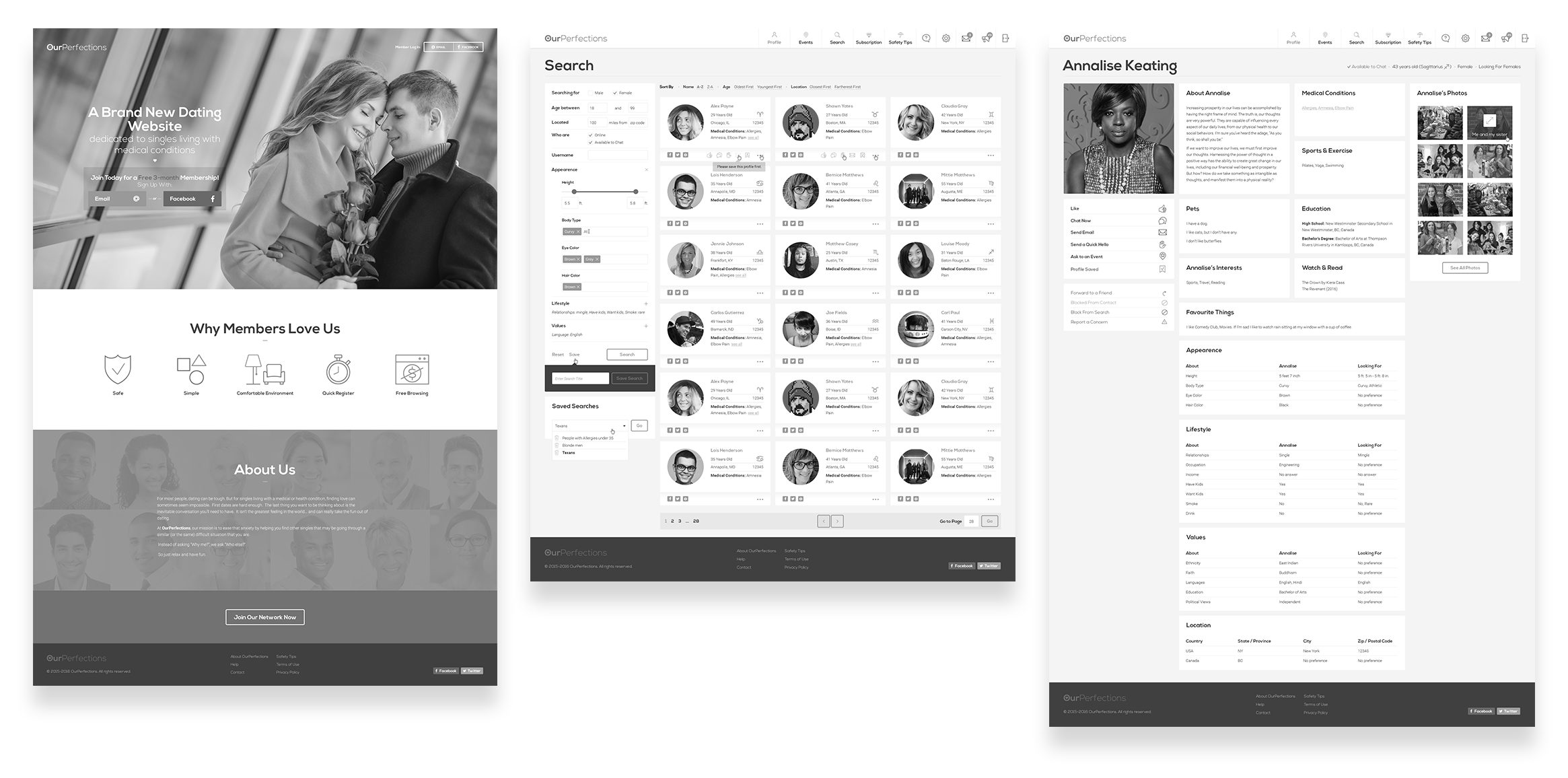
My another aim during this redesign process was making sure that all important sections are available from anywhere. Thanks to that, there is no need for user anymore to go deep into Subscription settings if they just want to update payment details. And direct link to help section about this specific page is always at hand, if user needs it.
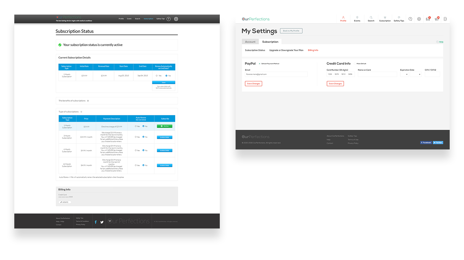
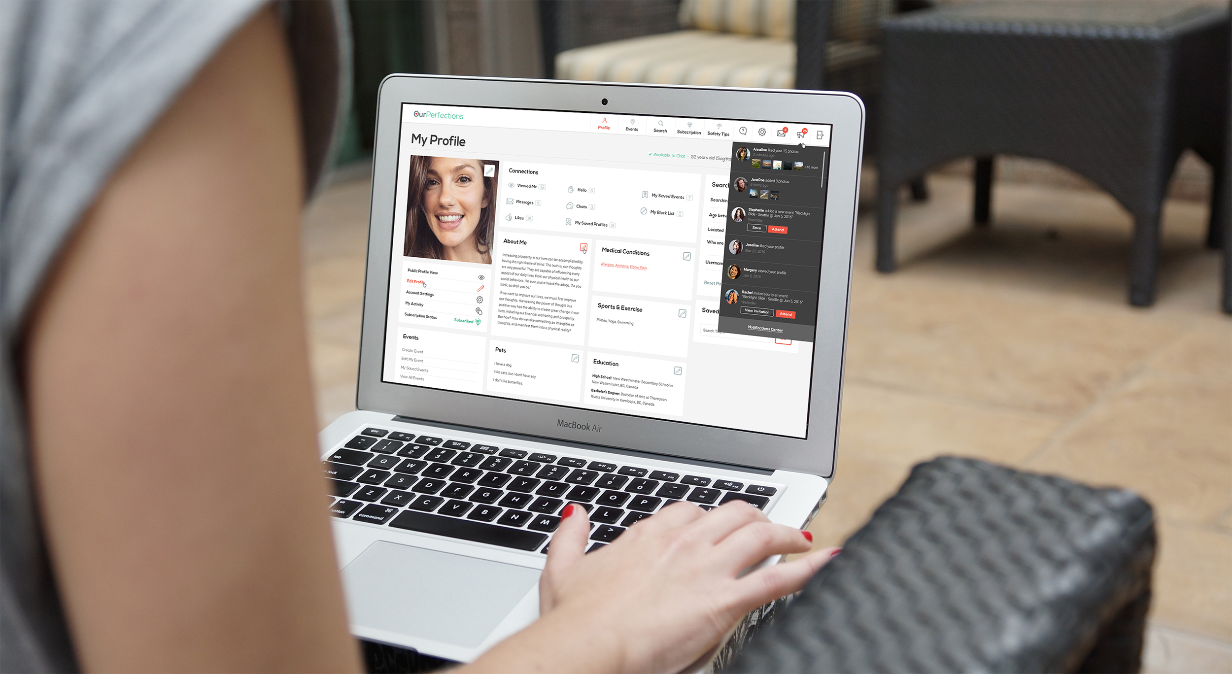
Many elements were made more prominent (such as Connections block, or basic user info opposite user name, subscription status in Profile page). Events now contain more information, and can be opened on separate page. I also created an interface for asking a person to event, which appears on button “Ask somebody”. Help center now contains not just contacts, but extensive knowledge database which can be formed from most asking questions. A lot of other small but important things were implemented or changed.
Small interactions are pretty important part of any interface. That’s why I thought through reactions of some elements:

Once design was finished, I packed all assets into structured folders and sent them to the client.
