Pacific Mattress Co.
Scope: develop logo, visual direction and website design for a mattress online retailer.
Role: brand designer, website designer, art director.
Year: 2016
When Pacific Mattress Co. was looking to launch its brand, they had an idea of how it might look like, and shared this vision with me. The client envisioned using a bear in their logo as a mascot and knew it should be bold yet clear and calming design.
The process
For the logo we went through 9 options, deciding on the pose of the bear. Here is the approved logo option:

Once the website structure was done by another designer in our team, it was time to bring color to the brand!
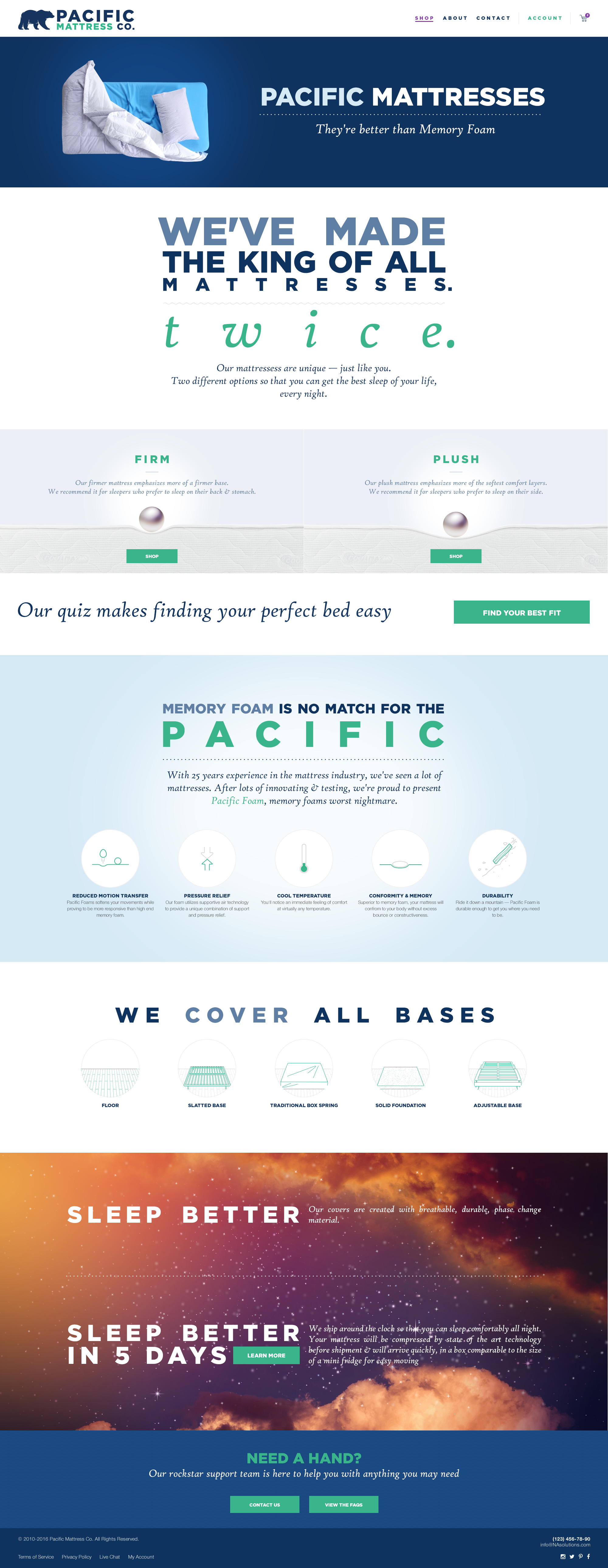
For the homepage, I chose strong lettering in combination with blue and green colors. A mixture of these colors is refreshing and flexible enough for a variety of use cases – from text to icons, banners, and other applications.
I made sure every information piece gets the user’s attention it deserves. Each block is supposed to take the entire user’s screen, so the website would feel more like a presentation, experience, guiding a user through major benefits of the product as well as company values.
I had fun playing with graphic elements, such as pearl displaying mattress density, or a funny bear at the bottom, next to the call to action button.
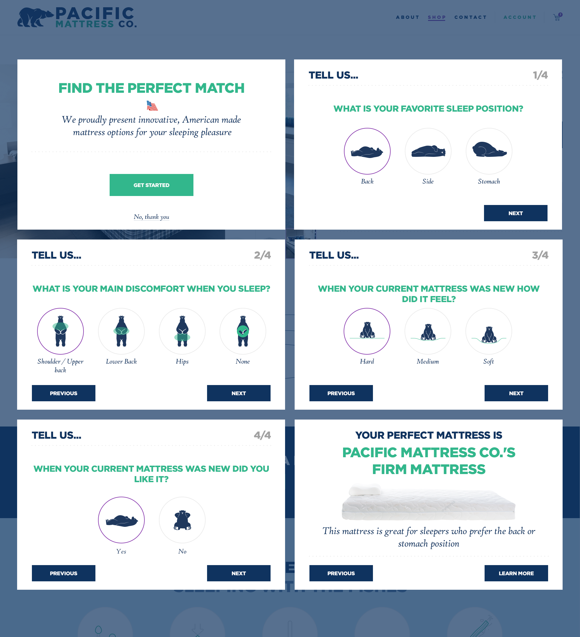
Among other screens, I developed the design for a quiz, playing with the company symbol – a bear. You can see it standing, resting, sitting on mattresses. It was another fun part of the project!
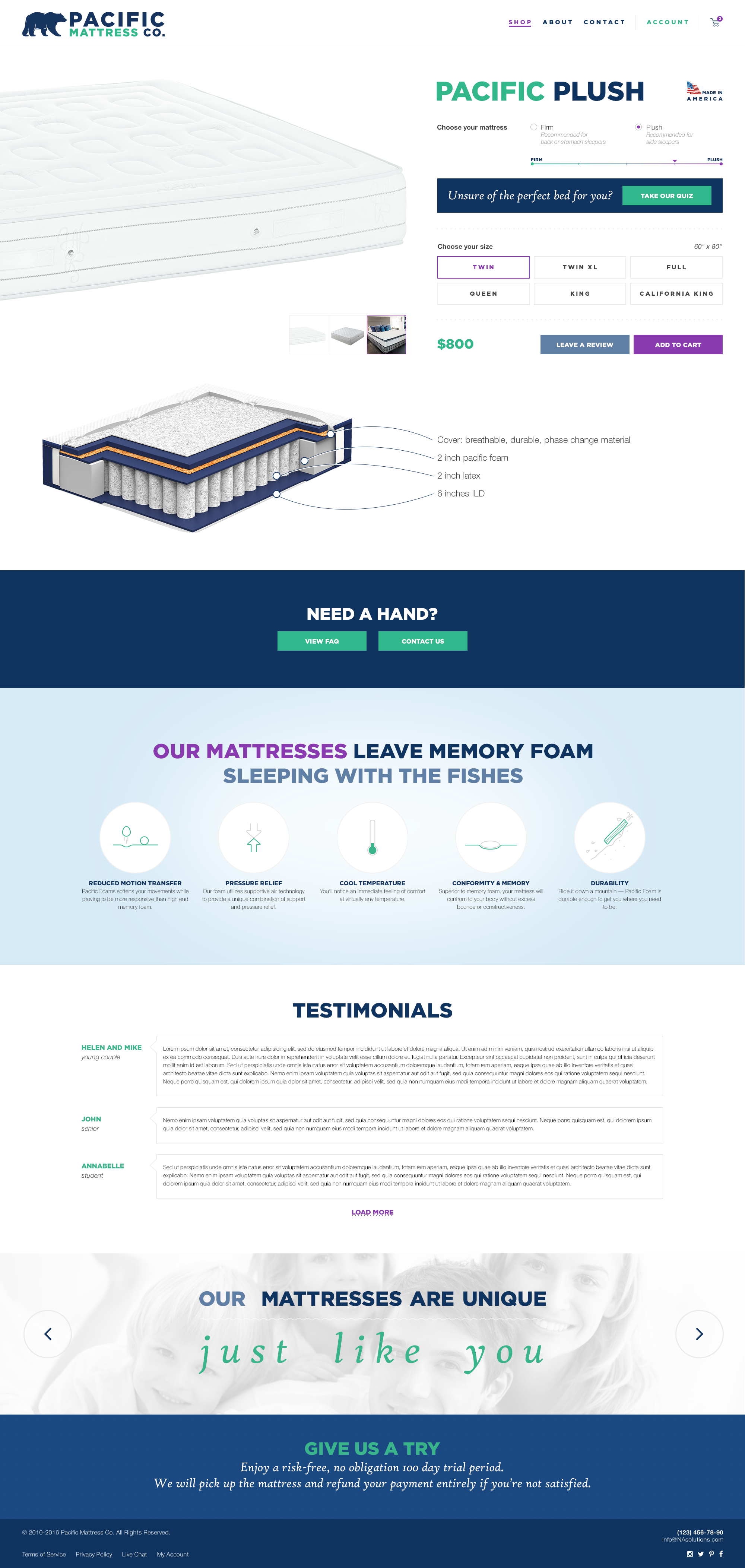
Below you will find other screens I designed for this e-commerce website, using the same sensibility as the homepage.
Shop page
Product page
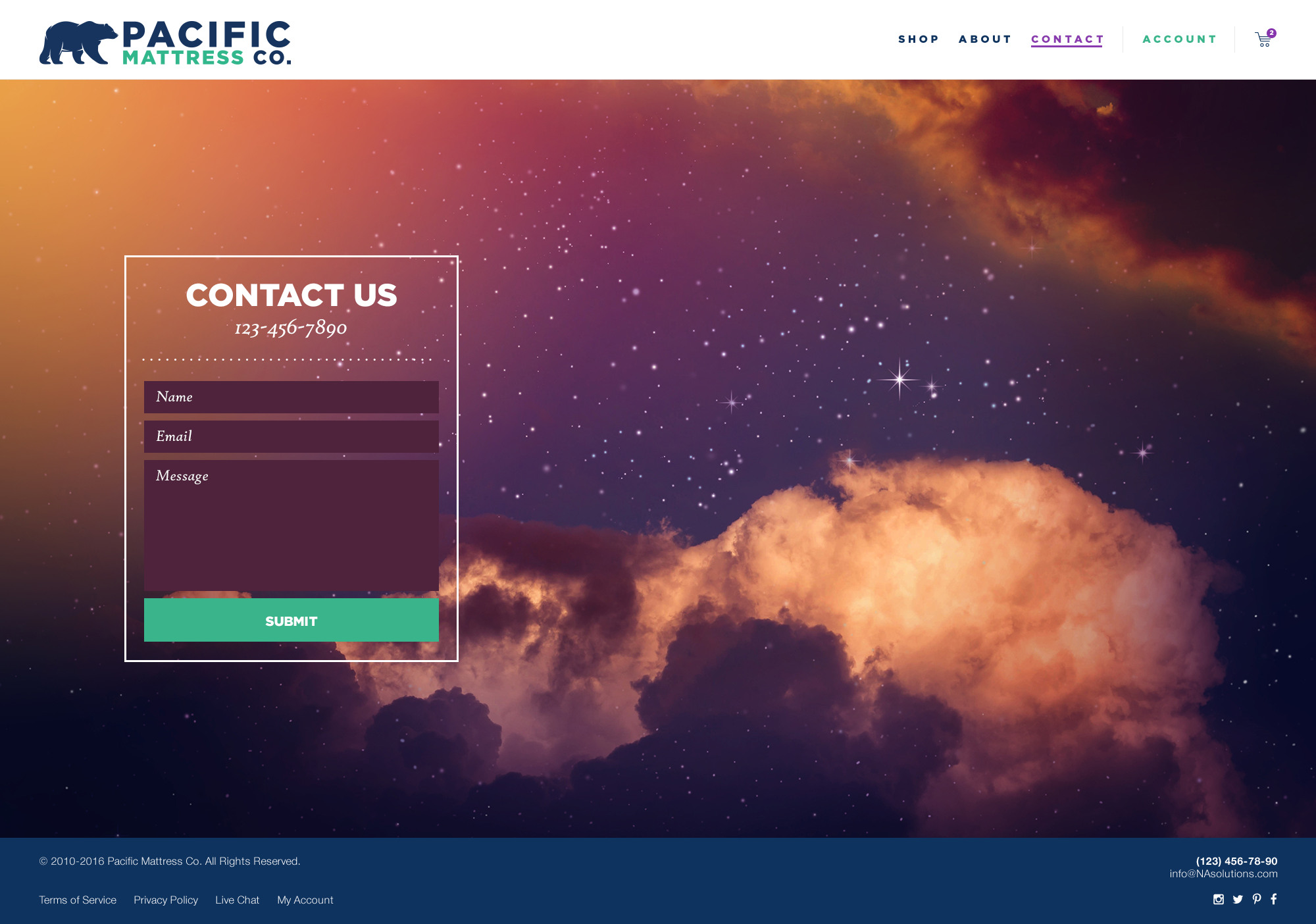
Contact page
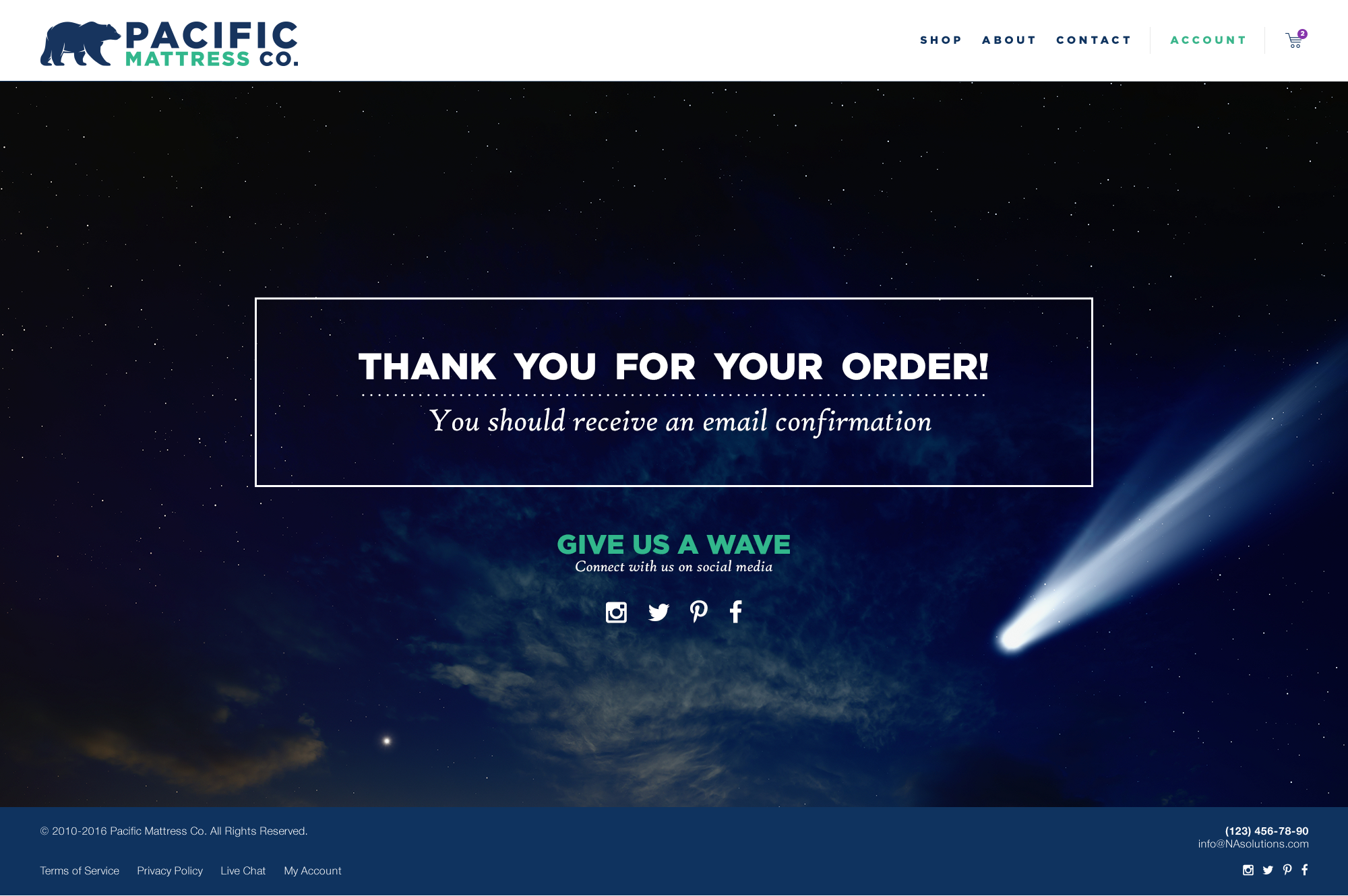
Thank you for your order!
The results
The client was really happy about the result! Even though their website has evolved, my bears still rest happily on its pages.