Scope: Capstone project for UX design course at RED Academy Vancouver.
Role: UI/UX designer, product owner
Year: 2016

Case study for capstone project at my UX design course.
Taking UX Designer Foundation program at Red Academy (Vancouver) every student, including me, was given a task to choose a problem, and develop an app concept for solving it within 10 weeks (program length) using UX design tools and methodology we learned. Range of possible problems to choose included all spheres of life: from cost of living and culture to ecology issues.
With this case study, I invite you to go through every step of my project:
- Choice of topic
- Research
- Creating user persona
- Use cases / storyboards
- Feature prioritization, MVP
- Userflows, information structure
- Paper prototyping
- Testing
- Clickable prototyping
- Testing
- Defining KPIs
- Conclusions
Step 1. Choosing problem to solve.
Vancouver is a big city which is full of opportunities. But like any other city, it has its own problems to solve.There were many interesting topics to discuss: food quality, issues with transportation, easy access to art and city events. As a result, I was choosing my app idea from the following options:
- Lack of time / knowledge / ingredients to cook healthy food (solving access to quality food problem).
- Difficulties with finding used things through garage or moving sales (improving sustainability).
- Poor awareness of all possible ways to spend free time actively (health improvement).
My choice was option #3. This problem exists among my friends for a while, and I decided to check if it finds whether it resonates with public opinion. But my idea here got a bit wider: I hope to find a solution not only to find interesting ways for recreation sports, but also to help users to start think sports and find companions, if needed, mobilizing them. I thought about some kind of inspiring and uniting resource, where user could find answers to their questions of where, how and who with.
At this point I didn’t have a clear vision of how my final product should look like: what functions should it have, who would be my final users and what devices would they use. That’s why I moved to the next step: research.
Step 2. Research.
Being at high school, I completed a Sociologist-Interviewer certificate program as a part of professional orientation. To be honest, at that time I chose this program because it was least useless among others I was suggested, and because I enjoy working with people, seek objective answers, and interested in psychology. During that high school course, I learned how to craft open-ended and closed questions, control questions, ways of communication with people, types of characters and how to work with them. But I never thought this knowledge could become important later, on another side of the planet. Red Academy helped me to realize importance of good research, reminded me about what I learned back in school, and refreshed this knowledge.
Putting together survey questions, I kept them as open as possible in order to avoid guiding user to answers I was hoping to receive. Using survey results, I expected to see the whole picture: who my user is, what are her/his interests and concerns, how they currently solve this problem, and what do they use for that now.
Also, I was hoping to find if this topic important for users at all, are people interested in it, and if so, what issues they usually meet around my subject.
I asked friends, classmates, users in Twitter, Instagram and Facebook to fill in survey I created with Google Forms. I also asked for interview with me on this matter.
My research consists of interviewing 5 people, analyzing 14 responses to online survey, and analysis of possible direct and indirect competitors.
PDF with questions for my interviews and survey can be found here.
In general, research showed that people do care about their activity, and even though most of them don’t consider themselves a sports person, they still choose to spend their time with recreational sports, primarily in the open ai.
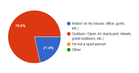
When designers think over a concept, sometimes they try to predict results, assuming that their idea should be useful, and who would possibly be interested in it. That’s why thinking about my app, I kept in mind young people 20–30 years old, who seek ways to diverse their activities in their free from studies and work time. But turned out that I was mistaken, and my target group is 30–39 years old married or common-law users:
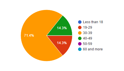
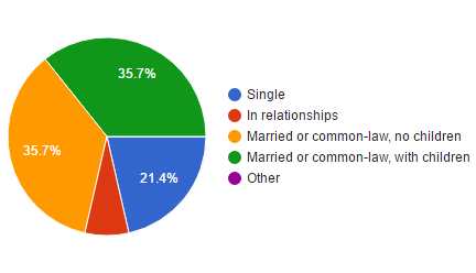
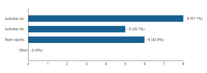
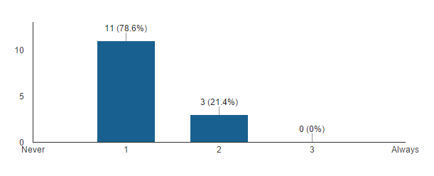
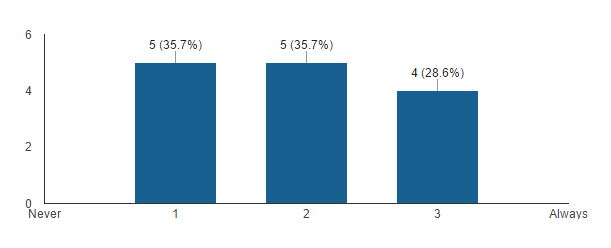
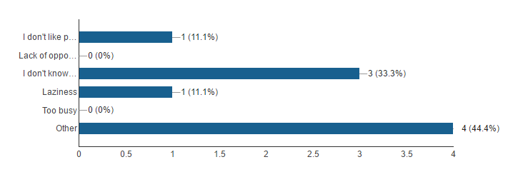
I did realize numbers are not convincing enough since I didn’t have many responses to make sure that this picture is solid. But I also understand that this is a student project: I should appreciate data I gathered, and make assumptions where appropriate.
Moving to competitive analysis, I found out that there are no direct competitors in this field, but a lot of indirect ones: basically every event-oriented website and social network can particularly take on functions of gathering people for casual sports and other recreational activities.
The most mentioned during my interviews websites were:
- Facebook.com (events section)
- Meetup.com
Asking people about websites above, I learned that they consider such websites to be valuable sources of information in general, but these sources are still not enough for potential users to help them be more active: all of them are too major for gathering such casual thing as basketball play after work. That’s why interviewees didn’t think of these websites as of possible tools for finding a game partner or a team. Another concern was about such websites not being related directly to the problem, and my potential users felt shy to post their sport events in these websites feeds.
Once results were received and analyzed, I moved to the next step.
Step 3. Creating user persona.
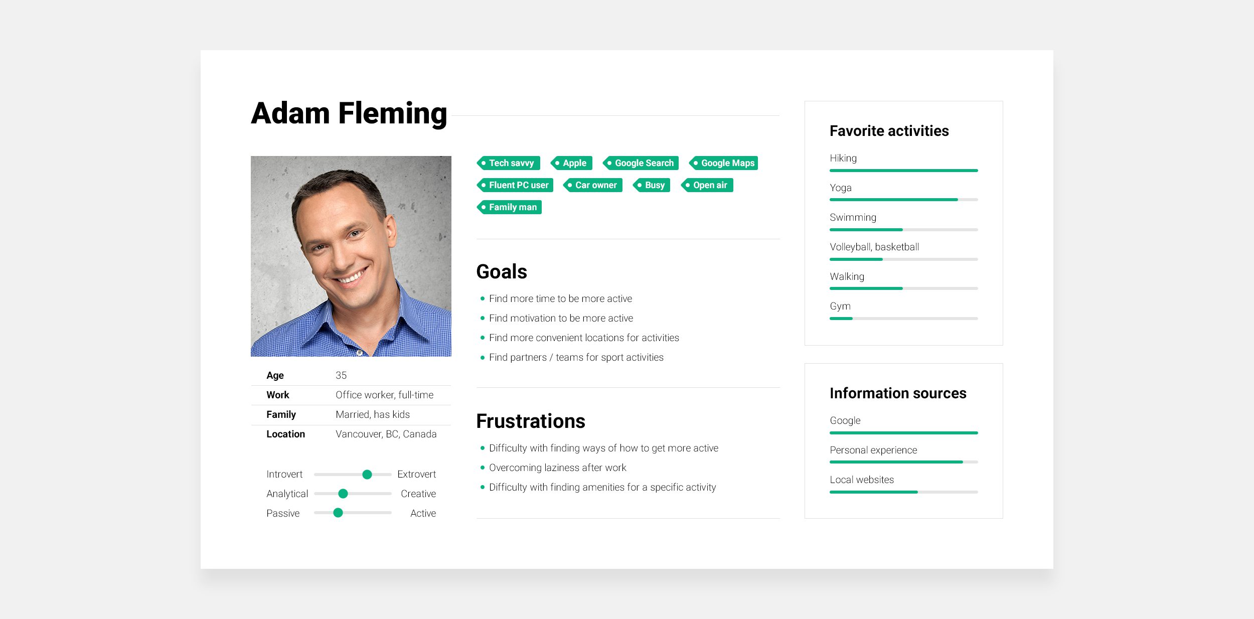
Research helped me to get to know my user: this would be a man or woman, who works full-time at office, comes home after working day tired, and interested in gaining some points towards healthier body and spirit, and is eager to spend more active time with family. In most of cases there is a lack of active events in life of such person due to busyness, or feeling exhausted after work, but he or she has preferences of what would be more enjoying to do when it comes to sports.
This person uses their iPhone or Android phone to search information, and in general feels comfortable with devices. In their free time, such person prefers hiking or yoga, and mostly uses locations they familiar with, but also is open to new opportunities.
At this point it became clear that the most demanded way of delivering service I plan would be a mobile app (not a website) since my user relies on their mobile devices.
Based on research data gathered, I created the following persona card:
Step 4. Creating storyboards.
This step was defining for my project. In order to form application features list, I should have simulated situations where I expect my app to be used, observe, how my user persona Adam would work with it, and then write down app features he used during his adventures.
I crafted the following scenarios (using on-line tool pixton.com). Application screenshots were added later, when I finished my work with prototypes.Attentive reader may notice that Adam uses iPhone with Material design interfaces. >_< No deep meaning here.


Step 5. Defining Minimum Viable Product and features prioritization.
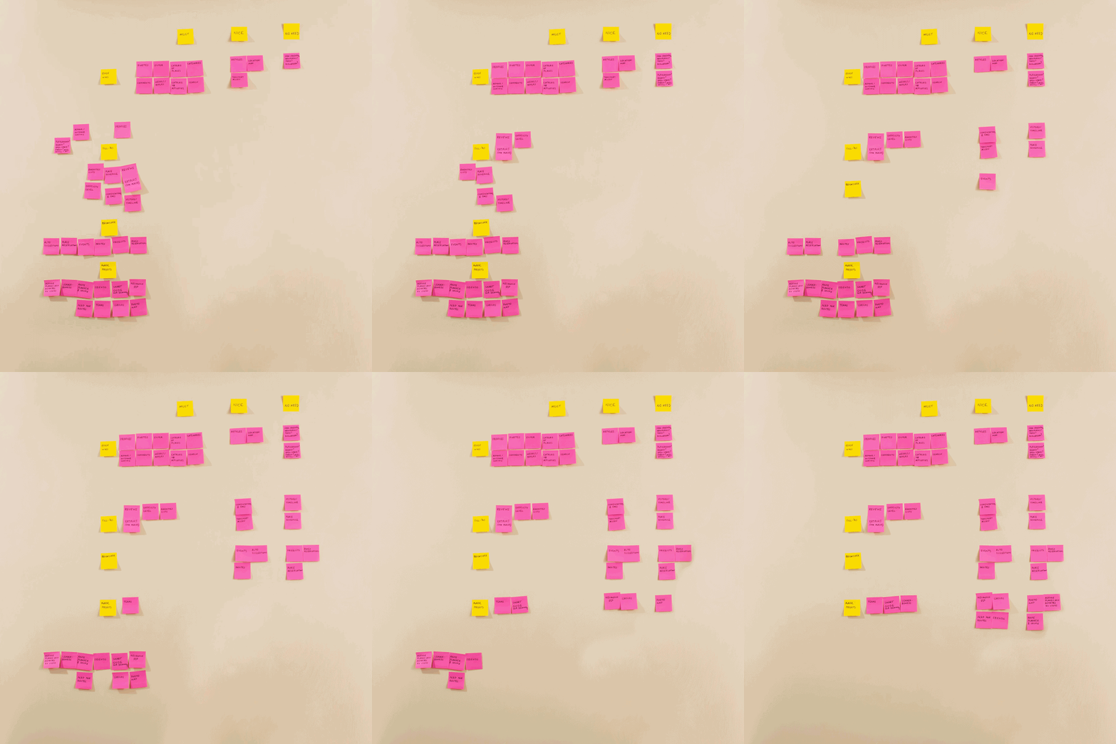
Based on scenarios above, I gathered the following list of features and sorted them out to define MVP.
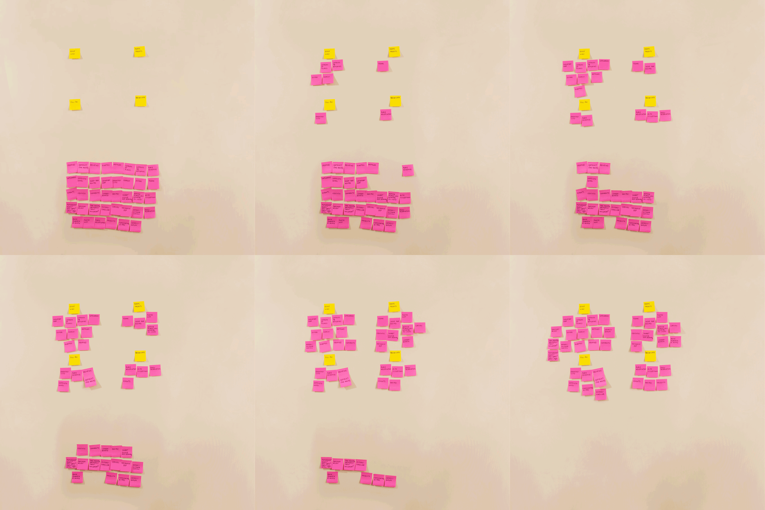
First of all, it was obvious that Adam used search and filters in all stories. That’s why post-its with these two functions were first ones on my wall in living room.
It was also clear that in order to make decision, Adam needed to see photos of a location, that’s why this feature became pretty important as well.
Since this app supposed to be crowdsourced, User profiles were required so users could add their reviews, photos and invitations to games.
In my stories, Adam constantly checked amenities and options for locations, and it was also wrote down and placed on my wall.
It took a couple of hours to brainstorm and generate as many features as possible. You can see result my table below.
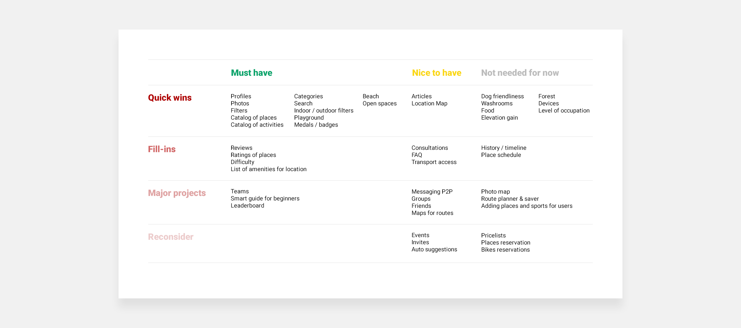
First, all features I generated were sorted into Quick wins, Fill-ins, Major projects and Reconsider sections. This classification gave me a chance to weight every single feature шт the matters of their level of contribution to the project: how actually important they are for the main idea.
Then, going granular, each section was sorted into Must have, Nice to haveand Not needed now so I could prioritize each set of features by time.This sorting is important for time management, project planning.
I found it pretty hard to put things in such sections as Reconsider and Not needed since first instinct was “Users need all of it! This is such a cool stuff!”. That’s why going back to research results, persona and his stories helped me to make weighed decisions. Every time I checked myself: what would Adam actually use, what features he would try out of curiosity, and what he could leave unnoticed at all?
Looking at set of post-its I generated, I was defining: without which of them this app couldn’t fulfill its purpose at all, and what features can I leave for later project versions.
For example, Teams section is a fairly wide but crucial for the whole concept. On the other hand, adding dog friendliness option is a pretty quick task, but Adam doesn’t need it right now.
Getting ahead, turned out that this is not a final version of feature prioritization table.
Step 6. Creating sitemap and user flows.
Once I had set of features at hand, I went deeper, and compiled information structure and userflows from scenarios using specific features from table above.
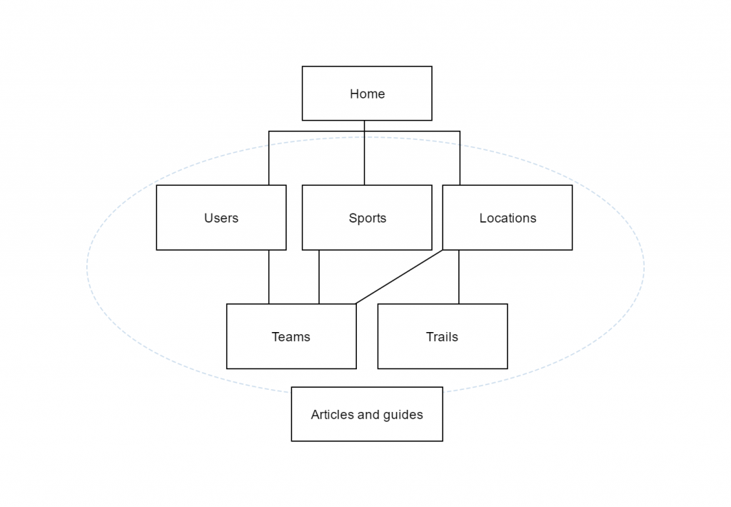
Above you can see a simple yet effective information structure I came up to. Three pillars of future app would be Users, Sports and Locations. They altogether form teams (because each team should have members, sport type and location to play). Locations contain hiking trails, which can be displayed as an option for a location, or as a separate item. And all these sections are covered with articles and guidelines/recommendations for users.
Userflows look a bit more complex:
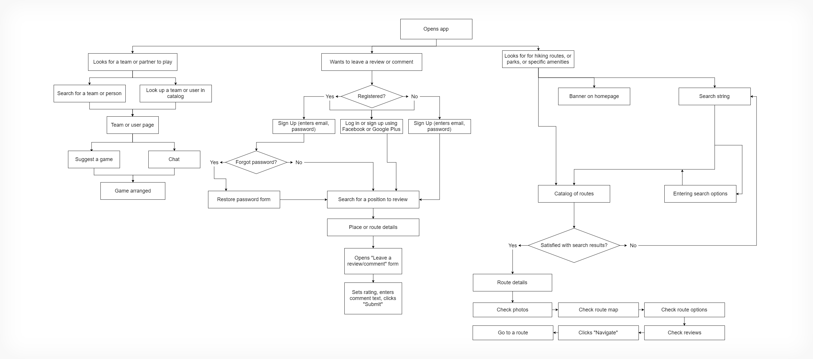
As you can notice, I narrowed amount of userflows from 4 to 3. Since looking for a location and specific amenities is pretty much the same procedure, I merged them into 1 userflow.
My biggest challenge at this point was creating a flow of arranging a game for my user. I thought about process which could help Adam enter an upcoming game as organically and casually as possible. He should be a couple clicks away from a game, as if he would arrange it with old friends. He shouldn’t deal with complications like funny wording or long forms. I didn’t want to make a big deal of it, and tried to make it as casual as possible.
In the userflow above you can see what I built at this point. But nothing is permanent, and this flow was changed later.
Step 7. Creating paper prototypes based on user flows.
As a UI designer I dealt with rapid sketching before. These were very, very low fidelity things, which helped me with iterating ideas.
But paper prototypes was a new technique, and I couldn’t wait to try it out. I did realize that this is a pretty time consuming process. But I’m one of these geeks who believe that if you want to become a good coder, you should start from notepad, and move to editors with autocomplete function only if you fluent with basics. That’s why I was excited to try paper prototyping out.
It had its pros and cons. As for pros — it doesn’t require any special skills and devices: only you, paper and pen. It’s easier to discuss them with people because you can take them anywhere, make notes right on them. But paper wireframes are pretty hard to iterate. If I wanted to change a section in prototype, and still keep it clean and readable, I have to redraw the whole thing. That’s why I’m glad I tried them, and will definitely continue using this technique in specific cases, but I remain a member of digital prototyping team.
Back to our roots. Starting these prototypes, I created 3 main sections first:Users, Sports and Locations. Looking at feature prioritization table, elements were filled in with details, such as parameters of filters in search, components of each card in catalogs etc. I madу sure that all prototypes are accessible from each other (so user could click them through starting from any page of this app), and conducted a shallow heuristic analysis, going through all prototypes pretending to be app user.
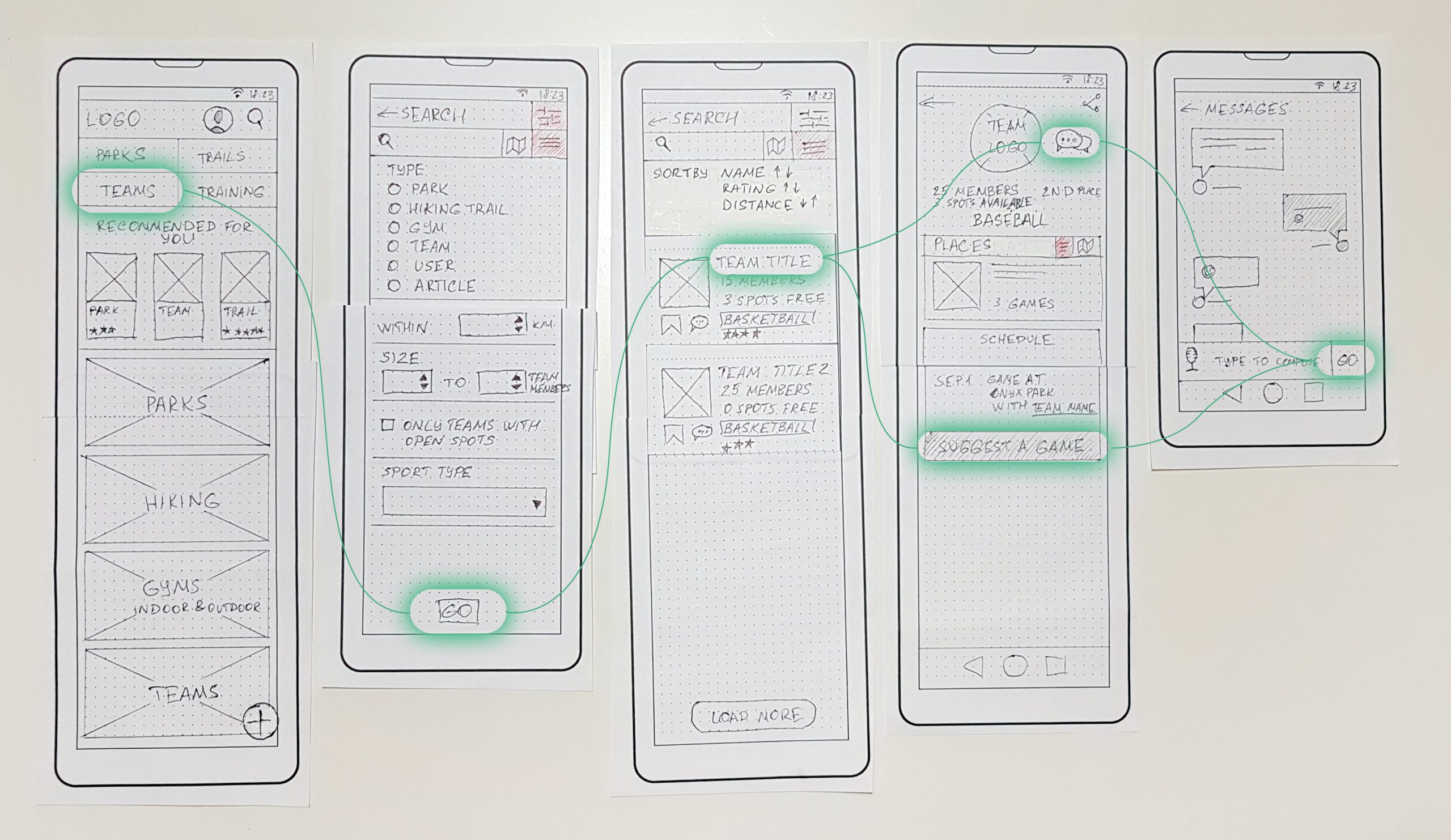
Once I made sure everything is logically arranged, I decided that my prototypes are doing good, and it’s time to conduct a usability testing.
Step 8. Testing paper prototypes.
I asked 3 people to participate usability testing and prepared 3 userflows for them, so 9 tests total were performed at this project stage.
I asked people to:
- leave a review to a location they visited recently;
- find a location to play frisbee this weekend (repeating one of user stories);
- find a baseball game tonight.
Testing environment was very comforting for everyone. We used a well lit table, where I sorted out and color-coded all prototypes, so they could be found quickly on demand. Questions were only open-ended, no hints or answers were provided by me, at every step I asked user to provide his or her thoughts, concerns, expectations, and emphasizing the fact that they can’t do anything wrong, and if issue happens — this is only my fault as a designer, not their.
Prototypes are doing good? Really? How could I think that way!
From the very beginning I realized that every other user has very different from others behavior. By the end of this testing I had 9 totally different from each other experiences to think about. Luckily, all these results, despite their differences, had a couple of patterns, so I was able to find uniform solutions for each of them.
Task #1 didn’t show any major issues. However all interviewees reached sought-for location in a different way, which was confusing for them and added a few seconds to process. I concluded that keeping lots of links to the same section is as bad as not having them at all. It was pretty unexpected result. That’s why home page structure was optimized. Two iterations later only one link to each section was left on every page, but this link became easy accessible, and now user always know where to find it.
Task #2 was the easiest for everyone. Each user had slight delay on home screen, but the rest of process wasn’t confusing at all. This task confirmed my conclusions that front page should be reworked.
Task #3 was a fail for my prototypes. None of users reached the goal. Issues were on every step: my wireframes couldn’t provide clear information on how to participate a game (what actions user should undertake), where to find team’s schedule. Also, I received an important insight: some of users actually don’t want to check in to a game online. Instead, they prefer to learn more about upcoming game (are there spots available, where game will take place), and just crash it. This section had to be redone.
After I finished my testing, I asked every user why they never used search filter (because it could actually help them). This insight was also important for me: users didn’t see filter button in top right. Instead, their expectation was to find this feature directly above list of locations or teams.
During these tests, I made a lot of notes and recorded audios of 6 tests just in case — all these data helped me a lot later.
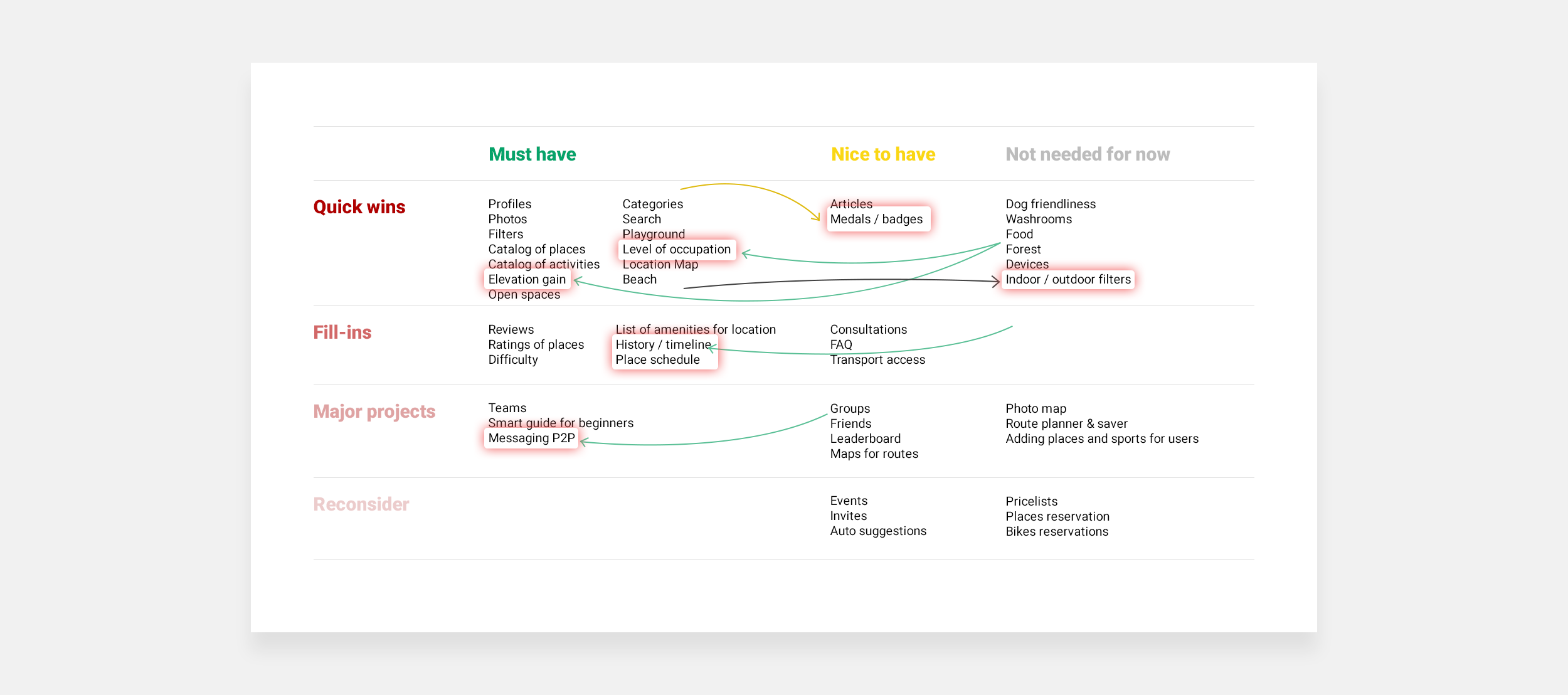
Once I finished my testing, I realized that not only my wireframes, but also my feature list has to be changed.
- Messaging appeared to be a very important. For those shy users who didn’t want to arrange their own game, messaging was the only way to ask team about details of existing games. That’s why it was moved to Must have column.
- On the other hand, Leaderboard wasn’t that important. Only one interviewee noticed this data, and it didn’t affect user’s decision. That’s why this feature was moved to Nice to have column.
- History / timeline appeared to be useful for users when it came to leaving review to location visited earlier. This feature was renamed to Check-insin later prototypes.
- Place schedule affected users’ decisions a lot (everyone tried to find this information on single location page), that’s why it was moved to Must have column.
- Several features in Quick wins row were also moved to the green column.
You can find edited table of features below.
Step 9. Creating clickable prototypes.
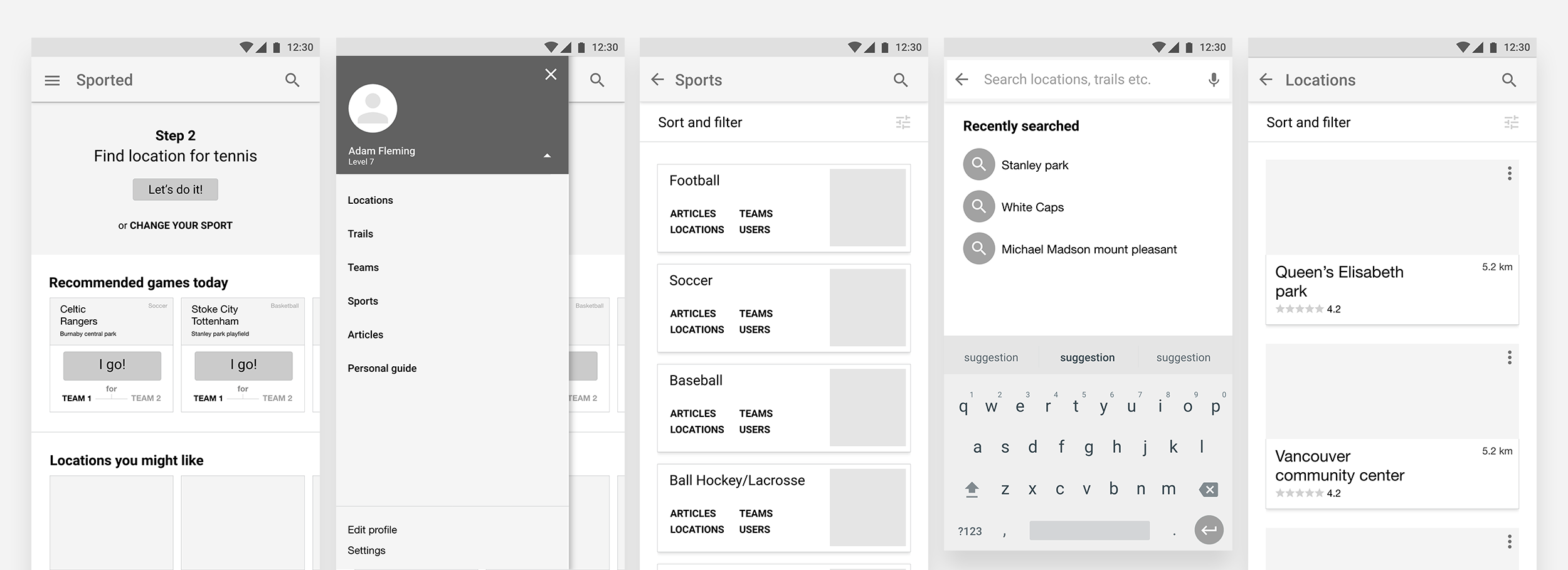
Turning paper prototypes into their electronic versions, I took into account changes in MVP and results of user testing. Feedback received from program instructors also affected my prototypes a lot.
Clickable prototypes were created using invisionapp.com tool.
Active prototype can be found here.
A few changes I would like to highlight.
a) Registration by email was removed.
Thinking about security issues, it didn’t seem safe to allow users meet complete strangers on games. For the moment I see the only way to protect people — to check them using Facebook or Google profiles. Perfect solution would be some smart check process, which could automate this verification.
b) Positions for chat buttons were changed.
Chat buttons are one of the most important functions on website. along with convenient search and smart advises, users should be able to communicate easily. That’s why this button proudly takes central place on user and team pages.
c) Search structure was changed.
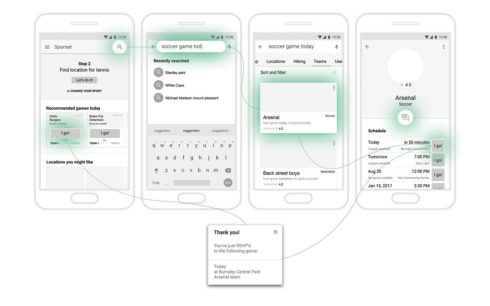
In order to provide a smooth search experience, instead of long search form as a central element, I suggest Flipboard-inspired mechanism. Newer version includes text input which I was avoiding in earlier prototypes. Now users can get results from all website sections at a time with just one text query, and filter them later using my very detailed filter forms. User will be able to type something like “football game tonight” and get filtered by distance and spots available list of results.
d) Checked if design elements match Material design philosophy.
Since I was developing structure for Android app, it would be useful to keep it within Material design guidelines. Using predefined principles which Android user expects to find in a native Android application helps to get them on board faster. In some cases this change meant reworking the whole structure of an element. For example, menu was initially planned to be stuck to bottom of screen (iOS style), but was moved into side drawer under hamburger button. Such functions as Share and Add to favorites were moved into hover context menus. Android users expect this behavior from their apps, and this is the best way to deliver smooth experience for them.
e) Change in structure of front page.
Previous home page versions couldn’t deliver main message of my app. New page includes block of information about where user stopped by last time with a proposal to continue this process, or to change previously set type of sport. User also is suggested to participate same-day games, which are already sorted by user’s sports preferences, number of spots left, and distance.
f) Made sure all wireframes use the same wording.
Last but not least. During the tests, users were a bit confused with different wording in prototypes. There were “Reviews” vs. “Comments”, or “Locations” vs. “Parks” (which didn’t make sense at all since user can search parks, sport clubs, community centres, stadiums etc). I always perform this kind of check in all my designs, but it was much easier to miss such inaccuracies during planning the whole project. The earlier this check is performed the better for testing results.
Step 10. Testing clickable prototypes.
At this stage I was only able to conduct one usability test for one userflow. I chose the most difficult for previous interviewees flow: attending tonight’s football game.
After couple of clicks out of curiosity, user confidently went into Locations list, chose location he prefers, and invited teams for a game at this location. This time user was much more confident about this task. Once it was finished, he continued exploring app, and found out that there is an opportunity to attend a game right from home screen. This function was left unnoticed in his first attempt, which means that it should probably be revised (depending on test results with more people).
Step 11. Defining KPIs.
Once second round of testing was finished, I moved to defining Key Performance Indicators for my app. This sort of evaluation is very helpful when it comes to analysis of product’s strengths and weaknesses. This is not a part of direct UX designer responsibilities, but defining the right KPIs and subsequent analysis of results could be extremely useful for improving user experiences, removing frustrations for users on their way to reaching their goals.
Since my app is on its first stage, project is currently on it’s widest part of conversion funnel: attracting users and familiarization with the product. At this stage KPIs could help me to understand tendencies: whether users are only going to keep their accounts, or they successfully use suggested features.
User testing helped me to reveal the following pain points which I associated with KPI lists to measure performance of these moments.
People are frustrated about finding the right locations.
— Increasing number of clicks on “get me there” button.
— Increasing number of reviews left for locations.
— Increasing number of uploaded photos.
— Decreasing number of suggested locations.
— Decreasing number of searches per visitor.
People are shy to enter a game planned by a team.
— Increasing number of games planned and RSVPs for these games.
—Increasing number of messages sent to teams.
—Decreasing time between search a team and clicking “I go!” button for a game.
Users don’t know how to start planning their activities.
— Growing number of medals, and how easy people achieve them (measuring time between achieving different levels of medals).
Future and conclusions.
This is how process of planning user experience looked like in my student project.
What I liked about that? Every step we learned at this program is predefined and specific. There is a little room for mistake since conclusions are mostly based on data and only a bit on reading between lines.
What would I do differently? I wouldn’t probably spend much time on paper prototypes, and concentrated on digital prototyping and testing instead. But anyway, I don’t regret about giving this way of wireframing a shot.
What’s next? I’d probably implemented onboarding screens for the app (3–5 steps) so user could understand its purpose better. I would see future of this concept as a sort of activities-based network.
Can’t find more time to discover all possibilities for activities around? Think that it’s too hard to start? Wish to find new locations just for a change, or probably looking for something specific, like outdoor ping-pong table? Or maybe you are new to Canada, or to your neighborhood? Or maybe you are a black sheep among your friends because nobody loves curling as much as you do?
It’s not difficult at all to start your casual activities from baby steps, to find like-minded person, or to diverse your regular recreational active experience using this service.
Thank you so much for your time on reading my case study!
Active prototype can be found here.
Please feel free to share your comments, suggestions, questions on Medium.